How did you manage to break through? So it’s not stopping you, but maybe enhancing the stuff that you actually do. I think one of the things that I always struggled with is that, from the visual standpoint like I’m, not a super talented visual designer I’ve seen some amazing visual designers that I’m just like. Oh, my goodness like that is really really slick, and I love that and that’s not like my strengths, and so I was a lot came back more from like the coding or a perspective being able to actually implement some stuff in code which they couldn’t.
But you know there was this kind of this deciding factor realizing. Am I more of a designer or more of a developer like you know, I’m not necessarily that great at graphics, but there’s still so many other ways of design that can kind of spread in so really like doing some research and finding about more about UX design And realizing that is really kind of wondered what I wanted to focus on, it’s kind of what led me to that.
So it’s definitely was this kind of process of navigating through it’s like. Where do I fit in my designer and my developer, were you know from the first projects that I started doing you know a lot of time? I did a lot of websites and when people come to you, they go hey. We need a website built, they don’t necessarily say hey. We need some front-end developer to come and come do this, especially if you’re working with smaller businesses and clients.
So you do take on the designer and developer hat to kind of make that happen. A lot of developers are very afraid to learn about design. It’s like, as I get question question like if I was to write an article, the perfect article for the developers would be how to how to learn to design or how do you, then, which makes no sense to me, because learning to design doesn’t really mean anything. It’s just like what part of design you know what discipline of design but there’s still that question of okay.
What is the first step? That’s someone who wants to really as someone who’s gone through this process yourself. What was your first step to say? Okay, that’s it! I’m becoming a designer right, I think you know following a lot of design patterns at that time. I didn’t really understand that they were called design patterns right. You kind of you implement them in the site’s doing a lot of web work.
You kind of take on okay, the navigation menu. Where does that live and you’re following a lot of the patterns that have already been created, and so you kind of learn to explore through that, and then you know, testing out the site and realizing. Oh, this doesn’t feel right like something’s off, let’s, let’s work on how to make this better, but I think one of the the great things that can really help designer or developers wanting to go into design is looking a lot of like the material spec guidelines.
They’re. Actually really really helpful, because not only does it actually tell you hey here’s some guidelines of what to follow, but it actually doesn’t really got a good job of explaining. Why you’re doing that yeah exactly so. That actually is really helpful because then you’re able to understand. Why was this created like what was the thought process behind, adding potentially a bottom navigation, or why would you have a side side nav? You know it’s it’s really getting to kind of explaining that so you’re able to learn from learn from actually interacting with something and seeing how they’re doing it, but also getting finding out why they decided to do that, because I think well so much of design is Some it’s problem solving right, so so many people forget that when I think of design they think of the finished product, but there’s so many different stages of how you got to that finished product.
And so a lot of it being able to understand how someone was thinking through that really really helps you from a development perspective get into that design field of understanding. Okay, how do I get from thinking of? How do I develop this versus? How do I even arrive to the solution? I think that’s the that’s kind of the big difference there as developers. You know you have something. That’s already designed for you.
For the most part, I mean some people get handed things. Some people get handed an ios mock and said: hey make this and make this into android. So then, at that time you kind of become an Android design. In that aspect, what you think is like the biggest thing that stops developers really understanding design. One of the things that we do at Google is we do design sprints, so the design Sprint’s are really great because it brings people from all the different disciplines and such leads together to work into solving a challenge that we have.
You know. So you have product managers, engineers, designers, researchers, everyone in the room together and kind of thinking and working through a problem which is really fantastic because you get all these different ideas and one of the things that I really notice is where, as we’re bringing in designers, You know and engineers, and all these people together is when we’re walking through the challenge.
The engineers are already thinking of the solution, yeah and already thinking about how to implement it. They go straight to that which makes sense that that is their role right as engineers. Usually, you are given something and you have to go. Oh, how do i, how do I make this happen? How do like thinking through problem solving how to actually get to that solution where, as designers, we don’t know what the solution necessarily is? So I think a lot of the blockers is automatically wanting to know the answer yeah, instead of being more aware and being okay with saying you know, I don’t know the answer to that, but let’s let’s explore it together, yeah, so I think that’s the biggest hindrance That can really stop developers and to getting into design.
It is wanting to have all the answers. It’s it’s okay, not to have them I mean, and what do you think developers can actually do to get past? That I mean because I find like for me. It’s way sketching and just experimenting, and so I suppose, is how does the developer maintain that kind of playful space where they’re, not thinking right, here’s the library we’re going to use to do like or whatever widget or fab or whatever? But what can they actually do that allows them to to not thinking about like the end result or breaking from that cycle? Yeah, you actually bring up a great point with sketching.
That’s probably one of my favorite exercises when I’m working with different people to get them thinking of solutions. So if you’re developing an app or so is hey, let’s get some sketches out there get a sharpie and just start sketching out through some ideas, because that really that doesn’t you can really get some ideas on paper and not be merry to them. You know and not feel like really connected, because you spent all this time developing the solution and realizing.
Oh, it doesn’t really work, and so, if you start really low fidelity with some sketches that can really open up your mind in terms of thinking about different solutions. Because as you’re sketching through it you’re realizing, oh like maybe I want to use this fab button or something everyone loves fab right, so you want to incorporate it somewhere and then you realize hmm, maybe that’s not the right thing to do and I haven’t spent all This energy developing or even designing this, so then I can kind of toss that and move on and create a different solution.
So sketching, I think, is a great resource. Instead of people go straight, a lot of people like to prototype in the code, but I usually like to challenge people and go hey start, sketching some ideas and then once you’ve landed on something that you think you want to explore. Some more then dive into code or dive into sketch or whatever your you’re using. So I suppose for the engineer to really understand design.
It’s almost like okay, just start sketching first and start thinking about the thing you’re going to build and the possibilities, rather then straight to the in solution. One of the things I really noticed there was the way really good designers responded to constraints. You know you think about: I don’t like black and white photography or jewtown prints, whatever their responses to restrictions on the medium
It’s good. Did you get a haircut? I did a haircut new accent, new new new. Look. You feel it’s good! It’s good you’re, looking better than before. You feel better than before. You’re, not mad. I am NOT no hi, I’m Rob Dodson, I’m a developer advocate on the chrome team, sure Rob just just sell, sell yourself. I mean hello and also uh you’re selling stuff, also host a little show on the chrome Developers.
Youtube blog called alley cast world-renown. Is that what we’re calling it yes well world renowned, I see people around the world have renowned it. I think, okay, all right, believe what you want to believe, but today we’re going to be talking about accessibility, audit, Angley right. What is your workflow for that? Look? Like yeah, so over here on, my laptop I’ve got a site that I’ve been working on.
This is called lifestyle. It’s got some cool like hipster photos and stuff, like that people have styles of the accessible and famous all right yeah, and what I usually do when I’m you know working on improving the accessibility of a site is, I will use the new audits panel in chrome, Dev tools, which is very very nice if you go to create a new audit, you’ll, see that you’ve got like a number of options inside of there, so you could look at PW, anus, best practices, etc.
One of the topic areas is accessibility, so you can just go run, just an accessibility audit. If you don’t, you don’t feel like doing the other tests. Here’s one that I ran against the page and it’s doing pretty. Okay right. It’s got on anyone not so bad, but there’s definitely a few issues that we need to fix and in particular one that I see a lot is, is color contrast, so you’ve got your your your foreground text.
Maybe is a little too light on the background. Color one of the nice things that we can do with the audits panel is we can actually dive in and we can see which elements specifically have failing contrast. So here I can see that I’ve got this like product card price element and if I click on that and stretch this out a little bit, you can see. It’ll take me over to my elements panel and I can actually scroll in to view the actual element that is failing just this price right, y’all, nice and it already selects the domnode for you, that’s cool, yeah, and so one of the things that’s really helpful.
Is you know really this is this? Allow me to sort of quickly identify this node, but one of the things we’re working on, which is over here in Chrome, Canary right now, is actually a color picker. That will make it a little bit easier for you to fix those contrast issues. So if you’re in something like Chrome Canary, you can go into Chrome, colon, slash, slash flags, you can look for the word: developer tools, experiments, oh you’re, in flags and experiments.
You look like to live dangerously, oh yeah, oh yeah, so dangerously, so we enable the developer tools, experiments right. We step into the future, it’ll refresh our browser for us. We can go back over here pop up in as the dev tools click on this little Settings. Menu good, where it says experiments da da and here we can see, we’ve got accessible the inspection as well as color contrast ratio line.
So let’s see what that does so we’ll go, find that same node. That was giving us problems over here. Inspect it and then we can see in our Styles panel I got a little color sread and click on that and you’ll see that there’s this little line inside of my color palettes. This is actually a sea mmmmm-hmm. This was actually telling us like. Where are our colors needs to be in order to have sufficient color contrast? So, since we’re above the line, we get this little warning that says, we’ve got a little contrast.
I happen to know that this is not like the final look for this piece of UI. It’s still being iterated on, but it’ll be something like this, where you’ve got a line and you can sort of tell which side is the good side of the bad side. So I can actually just drag this below the line. That warning goes away. You can see over here. It’s also like updating my element live in the document and it’ll sort of tell me what the good color contrast ratio is.
So I can just grab that value right off here and then go back and just fix it in my CSS. That’s pretty neat, so I was trying this out the other week and something that occurred to me was that you know if, if you use a developer, realize that the contrast is a little bit off, do you need to go back to your designers at that point, And say: well, is this okay for our brand and thing is that’s when they should be factored in earlier on in the process I ideal.
Yeah like this is there’s, there’s definitely other design tools out. There there’s, I think, there’s plug-ins for sketch, and things like that, which will also help you look at the color contrast for your designs and make sure things are not too low. Contrast, anytime, you can catch that earlier in the process, make sure all the designers are on board and all the stakeholders are on board and and that sort of like makes it easier when those things come downstream for folks to implement it, and it doesn’t kind of, Like a contentious issue or anything cool, that’s that’s awesome.
The house audit also had some other accessibility stuff in there as well right. So it had contrast. No, I was highlighting all the tributes to alt attributes, yep yep, so yeah. If we go back to that report, let’s see here so yeah a few of the things that that this site was failing. It’s missing some alt attributes. We’ve got form elements that don’t have associated labels: the big problem there is you land on a control, and maybe it says that it’s a button, but it doesn’t tell you what kind of button right is it the you know, sin my social security number to hackers Button, I don’t want to click that button right.
I want to make sure that I’m clicking the right kind of controls. I know what I’m interacting with we’ve got over. I think 32 tests, or maybe even over 35 tests in in the lighthouse accessibility checker here and under the hood. These tests are all based on a library called axe core which is made by some folks at a DQ so yeah. We we work at the axe, core library we leverage to the test from inside of it and we sort of integrated into dev tools.
You can hop around and inspect the notes. Real, quick, that’s awesome, so this is great again for locally checking on your accessibility issues. What about CI and continuously monitoring your accessibility? Is there a story for that too yeah? Absolutely so the the lighthouse library itself can be used as a standalone node module. So you can pull that into your CI process. If you want to do that or alternatively, you could use the axe core library that is powering these tests and you could use that standalone.
The the nice thing there is, you can sort of decide which accessibility tests you want to turn on or off, depending on sort of the criteria that you’re trying to meet very cool. So we’ve got lots of great tooling for accessibility, auditing. What about docks or education material? Yes, we have that as well. So if you go to developers.Google.Com/live Sunda mental, slash accessibility, we have a whole section there on getting started with accessibility for the web, and it also includes links to our Udacity course.
So that’s like a multi-week kind of hands-on experience where you actually like build stuff and read a bunch of articles and kind of get up to speed on accessibility, very cool yeah. I feel, like my lifestyle, is more accessible, already yeah cool yeah, thanks for having me today, yeah thanks for coming down awesome yeah people should check out ala cast: oh yeah, oh yeah,
Really Really different, Whereas if you take two colors that are very Close together on the color wheel, it ’ s, going to be harder to tell the two apart Now the reason why this is important in web Design is because often times our whole goal is convey some information to the user, usually Through text and images, But if the contrast of our text is a little Too subltle and too mixed in with the background, it might be difficult for the user to read.
The page and that might sort of degrade the user experience. So what I wanted to do today is walk through Some of the process that I use to sort of check the page and figure out if it has appropriate Contrast and how to tune it up if I find some issues But to start follow me over to my laptop And I have a little presentation that I want to show you It kind of walks through how we measure contrast.
On the web, So here I ’, ve got a set of text boxes on A white background, and up above you can see, I ’ ve, got these numbers up here for some Contrast ratios, So I ’ m measuring in terms of luminance The difference between this foreground color and this background color Now on the web. We actually have guidelines That try to instruct us what our contrast minimums should be So the web content accessibility guidelines, In section 1.
4.3, they say for body text: you want to aim for a contrast: ratio of around 4.5:1, for, like smaller text or your general body copy For larger text, something that is 14 point. Bold or 18 point you can ratchet that contrast ratio down just a little bit to 3:1. So if we go back and we look at our image – Of contrast, we ’ ve got these first. Two examples would meet that minimum contrast requirement.
So this one is just pure black on white, so its 15.9:1 Thats really high contrast. This one is a little more of a subtle grey But we still have 5.7:1, which is pretty nice. These last two, though, are just a little too Low contrast, so they wouldn ’ t quite meet that requirement. We can also actually bump this up, though Theres a enhanced contrast recommendation in the web content accessibility guidelines, As well So this is for situations where you know you Might have either an older audience or a low vision audience.
In that case, we can bump the contrast ratio. Up to 7:1 or 4.5:1 for the regular body text. So if we go back – and we look at this example – Here, really only this first one would meet that enhanced contrast, ratio requirement So consider who your audience is going to Be when you ’ re, building your site or application, and that can help decide where you want to Aim on the contrast ratio scale, I use a number of different tools to try to Figure out, if I ’ m nailing those contrast, ratio, minimums And actually my friend Louis, has done this Really cool thing where he has put together this accessibility testing for the web handbook.
Called OATMEAL, which stands for Open Accessibility, Testing Methods for Experts and Lay folk. He actually has a whole guide in here about How he measures color contrast and the folks on his team do that, And so we ’ re going to kind of follow this Guide a little bit, We ’ re not going to use all the exact same Tools, but this is a really cool methodology that you can check out and use in some of Your own apps to maybe figure out your process, So what I ’ ve got here is a website called The accessibility blog and we ’ re, going to follow two of the steps in that OATMEAL Guide doing a sort of semi-automated check using a tool like aXe And then we ’ ll, do a more manual spot.
Check using a WCAG, color contrast analyzer, So starting on this site, the first thing: I ’ m going to do. Is pop open, my DevTools, I ’ ve already installed the aXe. Extension For Chrome, If you actually check out our previous episode, On A11ycasts and I’ll leave a link to this down in the show notes we covered all the different Ways that you can install aXe on your system, So I ’ m just using the extension for Chrome Here – and I ’ m just going to open it up and check out this page and hit the analyze button, And you ’ ll – see that it tells me over here.
On the left that I have a few elements that do not have sufficient color contrast, I ’ ve. Got about 7 issues here: It ’ ll! Try to give me a CSS selector to the Elements that need some work, but there ’ s an inspect button that I often use to just Inspect the element in the Dom – and I can scroll up and say who exactly is this Alright, so we ’ re starting of with these Little anchors up here in our navigation – and this is one those areas that I see a lot where It looks like we ’ re, actually pretty close to having good contrast here, but we ’ re.
Sort of on the bubble – it ’ s, a little unclear. Are we hitting that or not So? What I ’ ll often do. Is I ’ ll. Take this Foreground color and I ’ ll, take this background color and I can use another tool this one That I often use is called Lea. Verou: ’ s, Color Contrast Checker, so I ’. Ll also include a Link to this down in the show notes, And then we can just drop in our foreground.
And that background color, and we can see that the contrast ratio of these two is 3.6 So its not quite where we want to be for smaller text Again, we want to bump that up to about 4.5. So this is an area where I know that I need To go back, and since I also have some of these elements right here that are even lighter, And since I know that this is pure white text – and I can ’ t make it any brighter, my only Real option here would be to make this header bar a darker blue, so that all three of those Links pop a bit more Another thing that we might notice in our Tool, if we step through some of the options, is that we also have areas down here like This little sub-heading, which we ’ ve, got a kind of subtle, grey on white thing, going On and again we can take that into Lea Verou: ’ s, Color Checker and we can figure out.
You know, Are we on the bubble One option if we want, we can make the text Bigger so we can maybe hit 3.0 contrast ratio That ’ s one option we just make the text Sort of larger, if we ’ re on the bubble Or we darken the foreground text because The background is pure white, so we can. ’ t really make the background any lighter, So we can go through and we can work through. Our CSS and tune those colors up and that ’ s really what a tool like aXe is doing It.
’ s actually, looking at the CSS values, For background and foreground, But there are some situations where a tool Like the aXe inspector is not going to be able to tell us if we have contrast issues And that ’ s in situations where we don ’ t have clearly defined foreground background. Colors So, for instance, over here on the right, I ’ ve, Also got this advertisement, and these are pretty common, where you have some text over An image background and the text itself might even be an image right So for a tool like aXe.
It can ’ t pick out. Two distinct foreground background colors, so we ’ re going to need to use another tool. To figure out, if we have contrast issues over here, So the tool that I like to use is the WCAG 2.0 Color Contrast Analyzer, It ’ s, another Chrome extension and I ’ m. Going to warn you, it ’ s a little bit buggy, but I ’ m going to walk you through how I Use it and maybe point out some of the issues, so you can work around those, But basically what we do here is after we ’ ve.
Installed the extension we ’ ve got this extension up here in the top right click. On that, What I found to be sort of an issue here is On retina monitors, if you try to tell it to analyze a region and you select a region, It ’ ll, be sort of off Like it sort of zooms in and it doesn. ’ t. Seem to be able to handle retina that well, So, instead, I ’ ll tell it to capture visible Content And what this is going to do, you can see That it ’ s already sort of zoomed in what this is going to do.
Is it ’ s going to try To scan all the pixels on the page and it ’ ll highlight the contrast between that pixel And the ones next to it, So you can pick out those areas that have Low contrast, While it ’ s scanning, so it will take a while Right, it ’ s, only up to 27 %. So far, so I can walk through some of these settings for You, though, So the first one here is asking us what level We ’ re measuring at So again.
I mentioned that we have the minimum Contrast ratio of 4.5:1 or we can take it all the way up to the enhanced contrast ratio. Of 7:1 right So again you can choose your target there. Then there ’ s. Also this pixel radius option And at first I wasn, ’ t quite sure what this was for by default, it ’ s set to one. So it ’ s. Going to compare the two pixels next to each other, but it goes all the way up to 3 Often times when we ’ re working with text.
On the page, it ’ s, not a clearly defined. The text ends here and the page starts here. Instead, it ’ ll, do a sort of anti-aliasing Thing So if we go and we look at the image of our Text this D: here it ’ s, actually sort of three colors. So we ’ ve got a couple greys and then the Solid white and that ’ s, what forms the body of that character When it ’ s, asking us what pixel radius that We want to use it.
’ s, basically asking us what sort of anti-aliasing range do you want? To accommodate, for So what I do is I tend to set it to 2. That way I can analyze a couple pixels next To each other, Alright cool, so it looks like it just finished. And what it ’ s doing here? Is it ’ s drawing these white outlines to show us areas of high Contrast And any place where it gets sort of noisy Kind of like right in here we can tell that we have slightly lower contrast If we go over and we look at that ad, we can See that yeah we definitely have some issues here So up at the top, where it says developer.
Friendly, it seems like it: ’ s, doing ok.. We can toggle this mask on and off. So when We hide it. We can see that when we get to the body text inside of this ad, it actually Is even more translucent than the header and when we get down to the bottom and it Mixes with that background, it ’ s, really really tough to see. So this is an area where we know we might Have to go back to the designer and say “ Hey, I can show you this and I can definitively Prove that there is a contrast issue here, and this is a place where we need to maybe Tune it up Either give the text a backing, so it pops A little more or figure out if we can use a different background image, something that Doesn, ’ t interfere with the text as much ” So yeah using these tools and using a guide.
Like OATMEAL, you can, through you, can analyze the contrast for your site or application. Maybe look for problem areas tune. It up make sure users have a better experience That about covers it for today. So if you Have any questions for me, as always, you can leave them down below in the comments Or hit me up on a social network of your choosing, As always. Thank you so much for reading. And I ’ ll see you next time.
If you want to learn more about color contrast, We ’ ve got some additional articles. You can check out in our playlist Again thanks for reading and I ’ ll see You next time,
So today I thought it’d be fun to go through my process for doing a simple accessibility audit a lot of times I have teammates or even like third party partners who reach out and they say hey. You know. I’ve got this site that I built, I’m not deeply familiar with accessibility, so can you give it just a once-over, and let me know if there’s any sort of like major gotchas I should be looking out for so I wanted to cover my process today.
This is not, you know, an exhaustive review or anything, but this is generally the stuff that you can do to find some obvious high level issues. So, if all the way over here to my laptop, usually the first thing that I do on any website, I’m going to use webbing as an example here, webbing is an awesome site for web accessibility. Usually one of the first things I do one on any web site is: I want to ensure that I can navigate using the tab key on my keyboard and that there are discernible focus styles, as I move around the page, so in the case of webbing, if I start tabbing through here, you’ll, actually see the first thing that it does the very first time I hit tab.
I get this thing called a skip link up here in the top left hand, corner skip links are super useful. You know on sites where you might have heavy navigation. You want to let the user skip immediately down to the main content, so webaim implements the skip link. Some other sites, like github, have skip links. If you actually go to github and hit tab, you might notice, it says, like you know, jump to your repositories or whatever so skip link is kind of a cool thing to look out for, but then, as I’m tabbing around the page, I want to make sure That I see a focus ring on different elements on the page now web aim actually does a cool thing here, where they animate their focus ring.
So you can even see it moving across the screen, which is pretty cool. They highlight their focus States. This is, you know, just about the best link, a tab focus behavior. I think I’ve ever seen really, but I just tab through the site, and I make sure that you know I can reach everything that is interactive using the tab key on my keyboard right. So that’s step one tab through your experience, so the other thing that I like to look out for is, as I’m tabbing around the page.
I want to make sure that there’s no off-screen content that can accidentally be focused so follow me over here. I’ve got this. This material design, Lite sort of like template site that the the team has created and notice that it has this sort of like sidebar over here and, as I’m focus moves into that sidebar right now. Let’s say I shrink the page a little bit right. So it’s totally possible that someone could have their browser this size on their desktop and let’s try it and tap through this now.
So I tab through this write. My focus is over here on the top left or sorry top right in that search field. Now it’s on that button. Now, as I’m pressing tab, though we don’t see the focus indicator, it’s as if it has disappeared and we keep tapping, we keep chatting and eventually it’s going to show back up. Ah did you see it down here at this? Like read more button, so what was going on there? Well, if we expand again, we can see that actually, what was happening was focus was sort of hidden in these off-screen fields was over here in our side nav, and so I see this on a lot of websites, and this can trip up.
You know anybody who’s using a keyboard to navigate and I can come trip up mobile screen readers because you have something off screen, but it’s still in the tab, water, it’s still focusable, so a screen reader might travel into those off screen elements. You know you might have dialogues off screen, you might have side nav off screen and you don’t actually want the user to be clicking on those during that current state.
So that’s another thing that I look out for. I want to make sure that people are disabling off, screen, interactive content, making sure it’s removed from the tab order. The next thing that I look for is I want to make sure that I can do kind of like a simple navigation of the page using a screen reader, so for this demo, I’m going to use the shop app by the polymer team. This is a pretty cool site that I work with that team, a lot to try and make sure that this was a good, accessible experience.
So, in the previous few episodes we covered how to use NVDA, we covered how to use voiceover on a Mac. I really recommend all web developers familiarize themselves with the basics of at least one screen reader just so they can quickly move through a page kind of like what we were doing with the tab key – and this is just sort of like a sanity check to make Sure the screen reader can actually like land on controls and they’re, announcing things that they should.
So let me turn on voiceover and all kind of like move through this page quickly, to show you what I mean by that all right. So I’m just going to use the vo Keys to kind of like quickly move through some interactive stuff visit, link, home link, shopping, cart, zero items, link where link ladies outerwear link men’s t-shirt. I might you know, try and move down to like Lane section. I want to land on an image right.
I want to make sure that that image has alt text. That’s really important a lot of websites, especially like e-commerce sites and things like that, you’ll move through and because they haven’t provided alt text for any of the images it’ll oftentimes just read like the file name for an image. So that’s another thing that I often look out for as and as I’m going through, this phase, you know, did the the person building the site use proper, alt attributes.
I also want to make sure that if there are custom controls like buttons and things like that, that have been implemented using either custom elements or using like divs with a bunch of JavaScript, that those are interactive with a screen reader. Okay, so we’re on this drop down, it says size collapsed, pop-up button. Let’s try and use voiceover to interact with this, so I’ll click on it. Okay, it’s reading me the number of items, and now I want to use just like my regular arrow keys to move around inside of this control.
So up down right, left right things like that, so go down to extra-large, hit inner right. Okay! That’s something that I look for right. Any custom control is working as I would expect with the keyboard. The other thing I know about this site is when I add something to the cart. It’s going to sort of add like a little sort of a like modal pop-up type thing that’ll show up on screen, and so I want to make sure that the screen reader user is notified of that, possibly by moving their focus into that item.
So let’s do that item added to the cart added to cart for items interact without it took our view. Cart, don’t close dialogue voiceover off, so you can see that when the item was added to the cart, the screen reader focus was directed into that thing. That just slid out on screen, so I know the way the polymer team is doing this, if I recall, is they’ve got something in there with the tabindex of negative 1 and they’re, focusing that element just to direct our focus.
So that’s another thing that I read out for making sure if, if something is being dynamically added to the page, that focus is directed to it. So that’s a quick pass that we can do with the with screen reader. The next thing that I do is I try and check the page structure, so I wan na make sure that the page is using appropriate headings and that there are appropriate, landmark roles or landmark elements on the page, because those help with screen reader navigation as well.
So, let’s look at something like Wikipedia which does a really good job of this. So I’ll turn my screen reader voiceover on Google and what I often do is I just opened the the rotor inside of voiceover in NVDA. There’s the. I think it’s called the web elements thing. I think we showed it off in the last episode. Basically, it’ll give you kind of an outline of the page in voiceover. You can open it by using a ctrl, alt or a control option you and just hitting, left and right to menu all right.
So we can see all the headings on the page. We can see that they’re doing a really good job of using. You know. H1. H2, h3, going all the way through the hierarchy of headings they’re, not just mixing and matching H tags based on like the size that they are, which I see a lot of developers do, which can generate kind of like a broken document outline for the screen reader. I want to make sure that when they’re using heading tags they’re using it to basically build the skeleton of the page, so you know we can right move through this content in a sort of a logical way.
So if I wanted to jump down to this, the section I can easily do so. The other thing that I look for again is is landmark elements. So, let’s, let’s go back and look at webbing, so webbing does a really good job of using landmark elements on their site. So again I open my web Roder. I look for landmarks and here we can see that there’s things like banner navigation search main. So if I wanted to bypass all the navigation and get right to the main content, I can do that right.
So that’s another thing I look for you know there are sites out there, which really don’t include many landmark elements at all and again, that’s sort of an efficiency feature that you can very easily add in use, use main tags, use, nav tag or use like you Know, role attributes to create those landmarks, somebody users who use screen readers can, you know, just navigate around a lot faster fashion, so that covers a focus that covers basics of screen, readers that covers headings and landmarks.
The next thing I check for is color and contrast. I want to make sure that you know if someone who might have a low vision impairment, it’s going to be able to discern the text on the page. So again, you know looking at a site like material design lite. This is a really attractive website, but there are areas where I think some of the texts could be a little low contrast and maybe a little difficult to read.
So there’s a really great Chrome extension that you can install on the Chrome Web Store. We can look for axe extension, so acts like a like a chopping axe right, so this is by DQ systems, and basically this is a simple extension that you can add to Chrome, which will sort of run an audit against the page and flag. A number of accessibility issues, but one of those is color and contrast. So on this site I can just open my dev tools after I’ve installed that audit.
You can see it’s right here in my dev tools panel, there’s this big analyze button. So I click on that and it goes through. It looks at the page and can tell me right here that there are some elements which need better contrast. So I click on that and it’ll actually give me kind of like a path to reach that element in CSS. I can actually even click on it and it’ll highlight that element in the dev tools for me.
So, in this case, for instance, this might be a little hard to see, but maybe I’ll try and boost the page. But you can tell that uh that these footer links down here right where it says right under this github logo, wears like web starter kit and help. These are low contrast texts that the audit has highlighted for me. So that’s something that we can read out for. There’s another extension: the let’s see the the chrome, accessibility, dev tools extension here we go so we’ll include a link to this as well.
It does very similar stuff to the axe extension, but one of the nice things that this extension does is when you highlight something that is low. Contrast it’ll actually give you a color suggestion, so it could be like you know. Maybe if you make the links, you know this different hex value you’ll be able to meet the what tag minimum. So, let’s see if we actually highlight these guys right here and then our dev tools, I’m going to go to where it says, accessibility, properties and see right here, lists this warning for contrast, ratio and I can actually click these color values.
And it’s very subtle, because this one’s actually like almost perfect – it’s not quite clicking these little sreades will actually change the text. Value on sites and it’ll apply an inline style for you, and that way you can see. You know what a better alternative color would be. The last thing that I try to do after I’ve done all of this is I try to recommend that you know whoever is building this site, integrate some excessive regression testing into their build process.
Again, if we go to github and we look up acts core, so this is the library that powers that axe extension, but you can also use this library as part of your build process right. So, as you’re running your automated tests, you can have a sample page. You can have axe core, look at that page and flag in accessibility audits, and you know those could then call your tests to fail. At which point you know you got to go back and you got to fix those issues.
Okay, so we we’ve covered a lot, but this is basically how I do my accessibility audits, it’s by no means exhaustive, but on many of the websites out there. This is how you’ll catch some of the major issues that folks need to work on. That can take their experience from totally broken to. You know at least sort of like a decent baseline experience for folks. If you have any questions, as always, you can leave them for me down in the comments.
Otherwise, you can contact me on a social network of your choosing, as always thank you so much for reading so yep hey. If you enjoyed this episode of alley cat, you can always catch more over in our playlist or click. The little subscribe button and you’ll get an email notification whenever we launch new stuff on the blog, as always, thanks for reading
Today, we’re going to dive into the tools that browsers give us to quite literally design in them will be using chrome, dev tools, a material design as our baseline to see where we can adjust and play. Let’s dive in like design tools, developer tools, help designers and developers build test and debug in the browser.
Luckily, there are a ton of great tools and plugins that make this process of prototyping iterating so much fun. There are tools from everything from color selection to finessing animation, to ensuring a nice user experience on a variety of devices and even testing load at various network speeds. Dev tools help us not only to see under the hood but to also make changes and decisions and see what those decisions look like in the browser, the medium in which we’re delivering the final product.
That’s why the series is so important as designers. We have to work in this medium and use it to our advantage to really have the most control and power over our designs and what’s the first tool that we need inspect element. This is the primary entry of dev tools. Inspect element is often how I open up dev tools just by left-clicking, an element and finding that inspect item in the drop down, inspect element lets you select an elements and get information inside of it.
This information includes the Cascade of styles, styles on various States, computed values, classes, shape and size and more you can even change the text content in order, the Dom of the element within the elements panel. You do so like this, so here I’m going to left-click on this heading and hit inspect, and now I’m opening up this information here – and this is the elements panel you can see. The sizing here is 350 pixels by 32 pixels and Heights.
We have the class name here of headlines, 6 and all of the class styles inside of that. You can see here that this Moz OSX font smoothing, is not being applied in favor of the WebKit font smoothing. So it shows you which styles are being applied and which ones are being applied. We also can see here this h1, so we’re getting styles from the h1 as well as the clasp on top of it, and it shows you which styles are being overridden.
For example, this font size of 2 M is being overridden in favor of a font size of 1.25 bream with the class MVC typography headline 6. There’s also a variety of element classes that I can play with here, and I think that this is a really great way to prototype. So inside of this, if I started typing MVC typography, we get an autocomplete evolve, the different type of graphic options, so you can just sort of scroll through and start to see what these would look like within here.
So you can see that headline. One highlight two aren’t actually making a difference and that’s because I still have MVC headline six selected, so you want to uncheck that and now we can see what the headline two looks like. So if you truly want to play with a baseline for the styling here, remove all the classes and then start to search the classes that are relevant to this element. So here we can see all the typographic styles and decide which ones make sense.
This also lets you separate your logic from your styling. Your logic is the date of the text content here. So this is a header one in this form fields element, but you can apply a class on top of it to style it. However, you want say we want to style this headline, one like a headline: five or headline six. We can do that and we can test that inside of this elements panel, I’m going to select the button now so here I’m just going to hit inspect on the button and it’s going to go right to that element, and we can see that this button has A few classes as well so right now we’re using the MVC buttons raised style.
But here I could select this outline style as well and put that in there. You can play with density inside of buttons, and these are all classes that I’ve just sort of playing with earlier applying them, seeing what they looked like testing this in the browser. So it’s a really powerful tool and there’s a ton that you can do by changing. Some of these Styles around you can reorder things in the Dom as well.
I’m going to just grow back into my UI here so say we want this headline. Maybe after the paragraph we could do that we’ll probably want to change that to be not an h1. In that case, you know make sure that your Dom still makes sense, but you could reorder things you could reorder the buns. You could reorder this remember this device text there and really just start to play with your UI in the browser.
So here you could even change the text of what this says: I’m finding this label here and now I can change this to always Pat disco, and now I’m checking I’m always going to Pat disco. This is a place where you can test our front language if you’re unsure how a piece of text will fit into an element on your screen, then you can test that and you can test this at various sizes. Let’s look at the color palette now.
In this example, we have a custom properties based theme playground for material design if you click to inspect the page and we’re opening up that panel and inside the HTML. You can see this route here with all the custom properties and their color values. So here we can start to play with what our colors look like. So if I want to change the primary theme color, I could click on that square and I have this whole array of color here that I can start to pick and choose and play with and see what that looks like in my UI.
Maybe I want like a bright paint color here. You can also change the color type, so here’s the hex code, if I click on these arrows here it changes from hex to RGB a to hsla and speaking of alpha. You can also use this alpha toggle to toggle the Alpha, which is the amount from transparent to full color and how much will show through to elma behind it. So we have all of these capabilities and another fun one.
Is this color palette, so in this color palette we get a base palette of colors, but we can also start to pick color from the page. So you see these page colors here were the initial page colors. These color variable is that the dev tools have found from the page as most proud colors on that page. So, if you’re working within a design – and you have a pallet that you’re working with you – can easily find the colors from that pallet inside of this dev tool here, there’s also the CSS variables that are being pulled out here that we can get the color values From and we can just start to really play with color in this way so say I want this to be a bright pink.
That sounds good. Maybe we want to change the color on that primary here. We can also change this color value. We can change the we can change the secondary color value, so we can change this to maybe a purple value and you can start to see how this cascades throughout the entire application. So now, if I scroll through, you can see that all the secondary values, like the check boxes, the switches.
This is all live code and we can see that this is in the browser, transitioned and transformed all these elements to be pulling in those colors in the drawer. Here we see a background on the active elements and that is also pulling from the primary color but being all but faded behind, so you can still see a contrast with the text on top of it. So by applying these color changed in the browser, you can really see what that looks like in various elements and in various states of those elements.
So let’s go back to the top up here and select this button. What we can also do in dev tools is figure out if something is accessible or not, which is a really great shortcut to have so here on the button, we have a color value on a background, color value. If I click on this color value, you can see that we have a contrast. Ratio of 8.5 point 1, that’s great. If we made that color value a little bit more closer to the background color that contrast ratio starts to get lower and you can see that that’s no longer accessible.
So we get a lot of help here when you have a color and background color within an element to help us make decisions on contrast and on colors that are accessible for our users. If we click this open, we can see where that’s accessible. So we can see that’s accessible for double a for a larger text and not necessarily for Triple A which means that we will have to have that white value for it to be triple a contrast, accessible and for this to work for our users.
Make sure that you’re keeping accessibility in mind at all times and you can use the color palette inside of dev tools to help you to do that, especially when it comes to color selection and readability on various elements. Let’s talk about the animations palette in episode 1, where we talk about motion on the web, we recreated this wringing button. So let’s inspect this element in dev tools and explore what that looks like behind the scenes.
So here I’m going to hit inspect on this button. I want to make sure that I have the button selected here and then in the bottom. Here we have this animations palette. Now, if you don’t have this, you can find it in this drop-down menu, this little kebab menu and you can hit more tools in the drop-down and then animations is the first item in that secondary drop-down. So that’s what’s going to bring up this animations palette for us so now, inside of here we see that we have multiple animations happening.
If I click open on those animations, we can find that on the button we have this grow animation, where it’s growing over time and on the icon. Inside of that button, we have this ring and I can actually toggle back and forth between here like this. Is a keyframe, I can go forwards and backwards. I can pause. I can play I’m going to pull this up a little bit here. So what I can also do is I can adjust the time stamps.
These are percentage based animations. So if I wanted to make this grow really long, this will break up the effect of ringing as it grows, but just to show you, I now have it sort of off-kilter. It’s ringing its ringing still sort of not changing its size, so you can start to really break things down here. I have it ringing very tightly in this section here. I could break that up too. You can move these around, so I can move it back and forth.
I can have this start to grow before I have the ring happening, I’m ruining this animation, but the idea is to show you that you can have animations that are separate from each other and then also test what this looks like together. So now I have it ringing off kilter from the size changes, but here, if you have a lot of animations that are complexed and you have to orchestrate them together, you can take a look at what that is what that looks like you can take a look At what the animations are happening inside of this element, so we have a box shadow change to as its growing and changing color there and then start to play with this start to finesse in the browser – and this is a really great opportunity for prototyping, because if Things are off, it’s a lot easier to see it visually.
That is, to try to read the code and figure out what’s a little bit off when those time stamps are different too. If you want to slow this down to get a little bit more of a finesse and detail here, you can also change the speed at which you’re animating. So here I’ve set 25 %, and I have this very slowly now, starting to grow and shake here. Starting to ring very slowly so this is another opportunity for you to adjust speeds and see where things are in a very precise way.
10 % is another speed option for very complex animations. Again, you can start to really get in there in the details and intricacies of these animations. Let’s talk about the device panel. Now I use this tool all the time and we’re going to showcase it. I’ve opened up the material dot, IO websites and I’m just going to hit inspect from any part of the page to open up dev tools, and here is that device toggle toolbar.
So I could also hit command shift M on my Mac computer, but anywhere that you’re using Chrome. You could always, let’s click into the browser, screen and open up dev tools, so I’ve clicked this open here. I have a few options. I have a responsive option, so I could see what this looks like at various screen sizes by dragging it over. You also have a drop-down here with some default devices like the Galaxy s5, the pixel to excel, to see what this looks like at various screen sizes.
We have the iPad pro here and you’re also able to adjust this from horizontal to vertical. So you can see what that looks like when you flip that device. That’s a little bit more dramatic on a phone here. So if you flip that you get a completely different layouts, you can also again use this responsive mode. You can even edit what the devices are that you want to showcase. So here in the dev tools, I’m going to pull this out and going to hit edit, and I have a bunch of devices here – you can add a custom device.
You can add devices that aren’t currently in your drop-down by default. So if you want to test, for example, on the iPhone 4 or if you want to test on the Nexus 7, I will now have these inside the drop-down. When I next open it so there they are iPhone 4 and the Nexus 7 somewhere in this drop-down right here. So you can see that that focal looks completely different than that iPhone 4 and that’s important for you to know.
As a designer. We also have various breakpoints here that allow for you to just quickly change between common sizes, mobile medium, large tablet, sizes, laptop sizes, and you get a percentage based visualization here, that’s scaled down to fit inside of this browser screen. So if you want, you can make this 100 % view you can make it a even larger view. If you want to sort of zoom into that, you can make it 50 % sort of fit in this area, and then you can see really large screens, 4k screens you’ve.
Even and if you don’t have a 4k screen, you can still test on those devices. Your design does change, based on the DPI of your screen and kind of is determinate of whether you have a Retina screen or non-retina screen, and that can also come into play when you’re deciding what images to send to your users. So if you want to test those, I have an example here with disco right how this high-res image and now inside of my dev tools, I can actually test to see that I’m sending a lower res image with the lower resolution browsers in my CSS.
I have a media query where I’m sending a different image based on the density of the screen. So here, if I have a high density, Retina screen, I’m sending a high resolution in and if I don’t it’s going to fall back to this low resolution image. So I can actually test this with a medium dpi screen inside of my dev tools, and this becomes really useful if you’re sending a lot of large images. And you want to think about performance for your users and for their devices.
And if all of those aren’t enough for you, there are some tools that you can use to extend these capabilities and make designing of the browser even easier. One of those tools is called this bug created by Adam Argyle. We’re going to fly over to him to have him explain why it’s so useful for designers right now. Hmm this page, I like the layout – I think, there’s a lot going for it, but it’s lacking some color.
Don’t you think? Well, let’s have fun and and try it out. Let’s make some color in here with this bug. All I have to do is launch it. In fact, I’m going to scoot it down off of here so that it’s not conflicting with the header and I’m going to start with the header. It’s just asking for a nice, bold color, don’t you think? What do you think of, like a purple, ooh, pink, a hot pink, I’m always down with hot pink all right? I’m actually settled that that’s great okay, you can see our guides tool is trying to help us make some alignment checks here, as we as we hover on other elements, you can get distance between them all right, but I’m also interested in changing this image up here And I’m going to drag in a new one.
Will I have an SVG icon here? It looks like this. Oh thanks for that that didn’t work out very well, but if I drop it up here, look at that. I replaced it. That’s kind of nice all right. So what about all of this these cards? I feel like they’re a little tight. I want to check. I want to check out their spacing here. So if I select I’m trying to select the card element in here and I’m having a little bit of a trouble because there’s so many elements in here look, I can actually select the elements inside of here.
That’s crazy town, but in order to get to these grid items, I’m going to select the parent and use keyboard navigation to help me get there. Someone hit Enter, which is going to select the first item as a child, so I selected the grid container. I hit enter and I selected the first one I hit command shift E, which is going to expand my selection. It’s going to find all the other elements to match.
I found them there. I still have the margin tool. So if I hit shift down twice, I’m going to add 20 pixels to the bottom, and that’s going to give me a little bit of spacing between my rows super neat. I can actually continue using this multi selection of I hit enter. I’m going to find that that each of these cards had a rapper element I hit enter again and I’m going to get the imaged container. That’s in the upper part.
If I hit tab I’ll find the next element in the layer tree – and I want to change the alignment of these, so I’m going to grab my flex box a line tool, I’m going to hit left and right and find a nice alignment and I’m going to Pick the center and I’m going to hit enter again and we’ll find that there’s a span inside of that container, and I want to change the text size of this. I grabbed the text tool I’m going to hit up on the the keyboard a few times here.
I’m going to hit command down to change the font weight and, of course it needs some hot pink. So I’m going to go over here to my color picker and grab that hot, pink from up top close out and see what I did and look at that. We brought some color to that page, really pretty quick and we’re able to just sort of express ourselves in a nice fast manner. That was fun. I hope you enjoyed seeing a little bit of taste of what vis bug can do for you super cool.
Thank you. Adam, I really love using dev tools. I use them every day for designing directly in the browser for prototyping for making decisions, and I find that these tools are just getting better and better and better, and that’s really exciting. For me, as somebody who likes to design and build the browser, what are your favorite to have tools? Are there any that we missed in the show, and that we didn’t mention tools that you use every day? I would love to hear your thoughts.
Please leave a comment below and thanks for reading the show we’ll see you next time save I just go.
My guest is Adam Argyle he’s a developer advocate at Google and creator of the viz bug, design tool and today we’re talking about the state of design systems. Let’s get started Adam thanks for being here, so I want to ask you what purpose does design fulfill on a webpage? What are its goals? Mmm. That’s a good question at a high level. I feel like design, does a couple things we have.
You know it’s supposed to be guidance. You want to have credibility, so that’s like the better designed it is the more credible it feels right. You don’t want to spend money somewhere where it looks like there’s no design, even though that might not accurately reflect the product or what you’re investing in. But I like thinking about at a very, very high level. What design is doing is we have affirmative design and we have critical design and critical design.
It’s the type of design that is exploratory. It sort of provokes you Brutalism as a good example of critical design where you’re looking at something is like wow. This is like stark and shocking, even though it’s sort of retro in a way so there’s design, can do really interesting things to your psyche. In terms of like challenging you and or we can see more of this affirmative design, which is kind of getting more popular, it’s safer, where you’re sort of piling on to the social norms of like what’s going on in design because it’s safe and it’s familiar and So folks will visit your site and they might feel old into an action because they visit it and it’s beautiful and airy and they might be looking at something terribly, not attractive, like let’s say a scrubber.
For you know your sink. You can make a scrubber and a sink look very nice, so you visit the site and says: do you have problems with your sink feeling? Dirty and nasty. We’ve got the scrubber for you, so it’s like every design States the problem, and that brings in the solution and that’s sort of lulling you into this behavior there like eyes and this familiar you’re here it looks like a normal ad.
It has the normal flow. Let me guide you down this path and we’ll take you through this excellent experience. So design does both those things that’s really high-level, to does a whole bunch other stuff too, but yeah, I think that’s sort of what it’s trying to do is credibility flow. You know somebody else has done the work to organize it for me, so it’s supposed to be easy, I’m supposed to be here to consume quickly and get a task done, guiding the user towards the solution for that weapon yeah, and in that case it’s usually the Solution that the webpage wants you to go down, which is where you know, design, has a little bit of cunning in there.
Some people say design is a type of trickery as well, which right we have like dark patterns that are like legit trickery, or we have light patterns, which are it’s trickery or we’re just sort of like? No. This is just a healthy guidance. You can you could diverge it’s okay, yeah, so in terms of the tools that designers have what is a design system and what are its goals ooh, so a design system, that’s sort of it’s a hard one to nail down.
It’s gone through all these phases. Ah, my current opinion on what a design system is is where we previously had design deliverables that were sort of like a design system, and then we had engineering deliverables that were kind of like a design system. Well, we have with a design system, it’s a merging of the two where designers have their symbols and their files that generally represent the same components that engineers are making and there’s like this coming together moment and a design system.
That’s what I think we’re currently personifying that as we’re before engineering had like a pattern, library or component set, and then the designers had a style guide. So what are some of the principles of a good design system? Ah, yes, okay! So, at a high level, I think a design system intends to make future us have easier decisions like in the future. I shouldn’t have to invent a new button. I shouldn’t have to invent a new login form like these.
Things should be solved already, so at a high level. That’s one of its most. You know valuable propositions. Is that future you, or even, if you’re, being really consider it like other customers of your design system, customers being maybe other development teams or the designers? Maybe even like the marketing team? You have people that want to use that those are. I call them your customers. So a good design system is considerate of them and it empowers them.
But I like a low level when you’re implementing a design system, you should have things like reusability extendibility. You should have accessibility built in. Essentially, these LEGO pieces should have solved a bunch of problems for other people already and and be battle tested and have gone through. You know: ok, I’m gesturing right now, but the gesture is imagine a rock that I’m tumbling into a pearl like we’ll take and then we’ll have a bunch of pearls to give so that other people can and get their tests done easier and also there’s some something About that, where you need interactivity as part of your design system right, I have seen some design systems that don’t just talk about the component.
They give you levers to pull so you can visit a page and there’s some tools out there that do this. Like a story book is one we have other tools coming like frame racks, so there’s like design tools that are coming out very either very focused on this one particular use case, or you have ones that are a little bit more documentation focused so they’re less like Compose and build and more like no tinker and play and assess what component you need beforehand, and I like that tangible learning it.
It’s really nice, especially for someone visual like a designer to come into a design system website and peruse and find a component and be curious and play. It helps get really sticky the features and the capabilities of that in terms of the life cycle of a design system. Is it ever really done or is it more iterative? No, I think they really only grow. I have seen them be reborn or we, you know, we’ve seen them bring reborn with brands or they’re reborn as complete redesigns, but no, I don’t think they’re done.
I think they’re growing. I think we’re making teams now to facilitate these things, because they are so difficult and they only grow in complexity because well, there’s considerations that are often lost like mobile. You know. A lot of design systems are like a look at our sweet, desktop design system and they’re like cool what to do on mobile. We’re like we’ll get there same with like accessibility and layouts and there’s like a few other things that I think some design systems can do to grow and be even better, and I think that’s just what we’re discovering right now, like folks, are playing and they’re trying To figure out what aspects of the design system are really meaningful on? What’s crufty and you know for young industry we’re all still learning kind of like what this means.
Do you have any examples of older design systems that we draw inspiration from today? Whoo, yes, okay, whoo, okay, so old design systems. I have a bunch of them that I’m a big fan of we could go back in terms of like inspiration and things that are influencing what we’re doing today and go back to print and be like print. You made beautiful style, guides or brand guidelines. You would give Legos to a client and that client could go put them on an envelope.
They could put them on some stationery, so that was a very early set of like Lego deliverables that had some rules and some intentions. Then you have operating systems that feel very much like design systems as well right. The first iPhone had a design system for sure they even had a document, the hIgG right, the human interface guidelines. I would like to see more Design Systems have a hIgG. Are we super cool all right, and then we had Android with Halo.
These are inspirations to me, Android with Halo, and remember that one dark and glowy everything looked like it had like lightning, bolts or like neon around it. Actually, you know what it looked like that was looked like that Batman movie was. I was like a UI based on that was kind of cool. It’s right. We had platforms, we had web kits, oh yeah, so this is like material bootstrap, html5, boilerplate, jQuery, Mobile yeah, those were and what they call those right, those weren’t design systems.
They were component. Libraries at UI framework, UI framework, yeah pattern. Libraries, they had all these interesting names. I think we also take inspiration from fashion. We have this kind of goal right now. I have this metaphor. I like to think about a design system. It’s like you’re trying to make a capsule wardrobe. That’s everyone else in the company should want to wear right. You’re like okay, I’m the designer.
We need to make uniform, looking things across our site and they should be familiar and an elegant, blah blah blah. So what they do is they go make this this design system? That’s essentially like making a set of a wardrobe like you can’t screw this up. Just walk in the closet. Grab a shirt grab, some pants grab. Some shoes grab a hat. Who cares? It all goes together and that’s a that’s a term from well.
I learned it from Pinterest. I don’t know where else it came from though, but the capsule wardrobe idea is this yeah grab and go wardrobe and we’re trying to make a grab-and-go design system. I’m going to hoppy and grab a couple things make a new layout, be on my way, so fashion, I think, is influencing us in that way too. They want to be very minimal. Alright, it’s almost like Marie Kondo, your your wardrobe like go in and pull all the stuff that doesn’t fit in the capsule.
Make it reduced set like reduce your anxiety by you, know, reducing your options, but I have a question about that like when you limit your wardrobe or you limit like your UI elements. Is it true that you can have one size fits all UI elements or sometimes you need to reach out and use something new and different, whoo right cuz, you don’t want to wear my clothes. Do you know yeah you should like dude, your wardrobe is well.
It looks like your wardrobe right like what, if I want to have my own looking clothes, and this is where it comes down to like well, and I have two opinions here. One is, I don’t think designers want to wear other people’s clothes. So it’s to me it’s a little interesting that we’re trying to unite. I think the goal is super right, like that. We do need to make reusable Legos that are extendable and and are helpful for future problems, but at the same time, the more you try to abstract and reduce these like very subjective visual emotional things into like little units.
They start to feel very functional. They lose some of that that excitement that creativity and I think people want to start breaking out of your design system at that point they feel trapped. So there’s like a there’s, a there’s, a struggle here with design systems, which is we want to empower everybody, but we want to not be trapped. We want to be able to pick clothes every day that are really easy for us, but then we want to be able to go out to a fancy dinner and not look like we’re dressing from our capsule wardrobe and especially if you have customers, customers want to Have unique aspects of the site, and so naturally they’re always pushing on the design system to extend even more.
This is a good shout out to to material and Google material. The new version looked at what their customers were, doing, which the customers for materials tons right. People all over the world using it from dashboards to mobile apps, and in that case they looked at how people were using it and people were constantly customizing it right. They didn’t want material, vanilla. They wanted material with my Flair, whatever that Flair was like right, like I want crunch material, so oblong it doesn’t exist, but maybe I should make it no, but yeah that they looked at their customers and they empowered them to customize, in an extent material as a Base, I thought that was really observant and it was like research-based it’s just a very, very nice plan for the next version of a design system to lean so heavy into customization and enablement of people to fork.
It’s almost like they’re letting people fork to to manage their own and they can still pull updates in that’s a really great segue into my next question, which is there was a comment on our previous article in March, the state of CSS, with you know, Kravitz our Guests and this commenter is cool twisted TV says the problem. Seeing lately is that most websites now look the same. It’s like they all have this standard template or something, unlike back in the day when flash was a thing, people used to create out of bounds designs along with tons of nice animations, but nowadays everything is flat.
All gridded up the same way with a few minor positioning tweaks here and there I miss those kinds of designs that today we rarely now see all because everyone is now into this flat and blocky design. Look slap a few fonts on a page and add a few pics and color on the background and you’re done: that’s 2019 for you. What do you think about that? You know we’re. Can an agency even working at startups? We couldn’t take a lot of risks and we were moving so fast.
The only thing to do was affirmative design. I think what this question is kind of poking at is affirmative versus critical design and they’re upset that everybody’s gone affirmative they’re, like ah you’re, just piling on to the currently socially acceptable design patterns and strategies. That’s so lame, which I agree, because I built a lot of flash websites and yeah. You could land on one of my experiences and it was like you’re in a fishbowl right.
It’s like fishing yeah. You could hover over the treasure chest and would pop open and bubbles would come out. It was way more critical, design way more like experimentation and in creativity was like. You were unfettered, but at the same time, if we think back at that because there’s, I think, a lot of joy and and fun that was there, it was less serious and it wasn’t really achieving inclusive design as well.
I think one of the reasons folks other than you know you know being safe – is that flat and and choosing some these modern strategies. They really make accessibility easier because you’re not going critically, you don’t have to go undo something to be inclusive, so I think inclusive design, which is a really impressive and great push that we’re doing right now. It’s also kind of inhibiting some of our exploration because we want to be able to reach as many people as possible and affirmative design is lolling right.
You visit it you’re like all right. Well, I don’t really have to stress, while I’m here or do very much deep, diving, there’s the navigation menu, there’s my primary reaction, but if I scroll down nope, there’s three little things that tell me about the feature this: the other features of this product. Oh Harry Roberts, today, Harry Roberts today writes this thing, which basically is like recoating.
This person yeah, I have a quote here flat design in the rise of more and more digital products, does seem to have killed off a lot of that exuberance and experimentation, which is a huge shame. I missed the days of seeing what adventurous and out-there things people were trying to create. You would log in every day just to see what crazy stuff people built, whether it was flash or web. I feel that I think, there’s a there’s another tweet.
I can never remember that guy’s name, I think it’s John gold huh. I remembered someone’s name. Wow we’ll have it. I know your name, yeah, Rick Vesco me mm-hmm screen name. This tweet, though, had two images up and it was like which site? Are you building the one on the left? Are the one on the right and they’re pretty much identical? They they’re like big there’s an app bar at the top there’s, a big header image with big diner was text in it.
That’s like there’s a problem and then underneath that it’s like what’s a solution right and they’re, both there and they’re the same they’re like the practically the bootstrap templates that you could get for free they’re, practically the the theme for every WordPress site is now looks like This and the coolest and most creative and critical ones might have a article playing right. What text overtop like put some extra effort into that one that pictures animated? Do you consider bootstrap to be a design system? I do.
I don’t think they do well, and maybe this comes down to where I’m I’m curious about what a design system is and how it’s different than a pattern. Library. I think I think it’s that designers were more involved in a design system, whereas, like bootstrap is very developer, led, I think design kind of came in a little bit later after their Legos got really popular and so yeah. I think I think their design system that just kind of got there in a different way and the result, the thing that they have the tangible thing I can go pick up off the shelf and just like place in my tool belt right.
I’m I’m Wayne right now from Wayne’s World, so I just got my like from the back of the car. If anyone remembers the Shockers anyway, whatever that’s bootstrap right now, I could go get that off the shelf and be immediately useful with it and solve my future problems. It’s like the same value, props that I got and and we’re sharing about a design system. You could get them from bootstrap, but it doesn’t call itself a design system.
I can’t remember what their home page says. I think they’re one so, according to the HTTP archive bootstrap, is used, unlike one out of every four websites, at least in some fashion, which is a surprising stat who knows to y’all, but could that contribute to this feeling that websites are all looking the same? If 25 % of the web is using bootstrap with the same type of layout, is it possible that bootstrap is a victim of its own success in a way whoo? I, like that phrase victim of its own success, yeah.
Yes, I I think they are this. This is funny. This reminds me of two two metaphors I don’t want to share like bootstrap is funny it like. If you think back to high school, there was probably a super cool band that their album just came out and you really little dead band, so cool and you listen to him a ton. They made a second album with Chapter four made, a second album when you’re like this Bay, it’s still cool or bootstrap three, and then it gets really popular and everyone’s.
Listening to him. It’s like some fool who you don’t like, shows up wearing the band shirt and you’re like okay. That’s it done with this print and you start calling them a sellout and the reality is just like they’re now popular they’re, not making money they’re successful. You should be happy for them, but instead you’re turning your nose up and like this, like defensive, disgust like I don’t want to use it anymore, even though all the stuff you’ve built with it was great all the music and moments you had with that band.
We’re really nice, but it’s hard for anything to stay in fashion for too long, that’s kind of like the second metaphors, like the Wardrobe, we all had favorite stores we shopped at back in the day whether it was zoomies or gap or whatever right, and these were Like places, we went to go, make easy decisions that helped us get on with our day and that we were still picking something like relatively cool and meaningful, but then it just gets old we’re kind of rude as humans.
You know we we we burned through stuff. All the time we consume it and we’re like this is so good and then we throw it in the trash. So I think bootstrap is a victim of its own success, but it’s also very much still a success. I think being successful is hard. I mean look at any big framework of like whether it’s a JavaScript framework or big design tool. As soon as you hit the big shots and like you’re the cool one, everyone wants to take you down and that’s that’s a hard life to be in so bootstrap.
Stick it out, I think it’s still a great product. It’s obviously just reaching a different market. Almost like the pop band right, the pop band Green Day right loves their first couple. Albums third one came out, didn’t want to play that band anymore, but they reached a whole new set of people, and those folks fell in love with them. In a way that I didn’t – and I shouldn’t say that Green Day is bad.
I should say that Green Day is successful and they’re reaching new people and I still like their dewy, so you’ve spent a year as a UX engineer at the Google cloud team, as designed systems engineer so to speak yeah. What was your experience on that team? Yeah? That was really I was oh, so illuminating, so yeah I was a my title was really long ready for this. I was a UX engineer on the design systems team of GCP through a design lens, so they have two different types of UX engineers.
There’s UX engineer, engineer and then there’s UX engineer design, so I was in the design side. I was in a team of four or five other UX engineers who were supporting the design system, which had a big team, and I this was really cool to see how much commitment Google had to their design system. In so much that this team was made up. Of three teams there was a trifecta. It’s like a triforce of folks were managing that design system.
That design system is creating jobs, and it was really interesting to see how all of them were working together. What problems they were solving. There’s two things. I want to point out the first one I think is really interesting in meta, which is Google here I’ll just start with the first one it was built on angular, so is angular, which was transitioning from material one to Google, material and angular was doing a good Job at this work, the the struggles that they had were with how many customers that they had.
So this is where I like this meta comparison. You have Google clouds and their design system, which they call their design system, a condensed version of material. So it’s like a child seam. It’s like they forked Google material and made an enterprise, condensed version, that’s not as airy and fluffy. That’s interesting, because that means Google Cloud is a customer of another design system. Simultaneously, they have hundreds of customers, so they’ve got customers that are internal right, App Engine there’s like various products and each one of those products has a team.
Each one of those teams are consumers of this design system. That’s crazy! Then you have third-party players. People don’t want to add plugins or other support and other features into GCP that also want to use your design system. So they had this really really unique scenario where they were simultaneously a customer of a design system and a producer of a design system. Anyway, yeah. It’s meta I liked it and they were really adamant and very good at listening to all of these different customers and trying to make this thing work for everybody.
But it’s a very difficult task. They’re hiring they have tons of headcount, because this is GCP is humongous and they need help that and the UX teams they are really fun and really cool. So, if anyone’s looking for roles GCP in seattle, we’ll put a link in the description yeah sure so you mentioned something earlier. I want to come back to inclusive design. What is that, and what is the purpose of it? Oh man, this is so inclusive design.
We want this is so funny. It has a name, because I feel like it’s the thing that everybody’s wanted the whole time. We want our content to be accessible for as many people as possible right like. Why did we have to put a label on that? And I think the label is there and what it means is you need to have a site, that’s accessible, which really means you just need to test. First testing your site for accessibility is always this awesome.
Empathy experience where you’re like. Oh no, my sites, probably fine on that. Then you go tap through you’re like it works. It’s not elegant and that’s sort of like inclusive design, is like taking that extra step to empathize research. Ask folks and adjust your design to be more inclusive. So this can come down to things, like contrast, ratios font weights than this tab flows and stuff, like that, so looking ahead, what do you see the role of components and future Design Systems? I think we’re only going to get more complex as things go on we’re noticing now that our components aren’t good yet still, especially once you get to inclusive design areas where you thought you were done, and then you go test and you’re like.
Oh we’re not done. Sometimes those can shake the whole foundation of your application, and I think it’s healthy, though, that people are investigating that other future things. I would love to see you know voice. We have so much voice interaction coming in. Why don’t? We have a design system for a voice. I think that I’d be really interesting green lines. I would like to see design systems providing green lines.
Green lines are an accessibility indicator, so we’re a red line. Is you just saying I intend for this avatar to be 45 pixels wide and 45 pixels tall with a border radius of 50 percent? So it’s a circle like you’re. It’s a traditional way of marking up a document to encourage or or be precise, about, the presentation that you want. Accessibility is a similar, similar push. We’re like I’m going to go in here and I’m going to look at this little form input.
I’m going to look at this form button I’m going to go and indicate that these three areas should be tab. Indexed this way and it’s sort of a designer taking control of the accessibility, experience and saying, and I’m just being very deliberate and clear about what it is. They expect this to do and yeah it’s nice. It’s the designers making those decisions, as opposed to leaning on front-end, to do it and how about mobile mobile is usually forgotten.
All right, so we’ve got components or it’s funny. Material most of the opposite material is mobile first and then you sort of have to expand on a couple things to get desktop to work most Design Systems. I see these days our desktop focused and then they they start to squish things down as things go. So I’d love to see mobile, included, more components, yeah good call. How do you see the relationship between designer and developer evolving? I want to see them communicating a lot more.
John Maeda recently had a very provocative titled article, but ultimately, what he was pushing for is a switch and strategy where traditionally he was a proponent of design LED. He was like yeah. The designer should be at the top of the company, maybe even like making all the decision it’s like. If you do that, then elegance is sure to be achieved and that’s successful in a lot of ways. But what he’s seeing now after a few years of this is that engineering is really really important to engineering is required in order for elegant design to even be achieved.
So what he’s saying is no designer, I’m probably going to you, know, butcher this title, but no designer will be more successful than another designer unless they’re integrating themselves richly with engineering. The pitch is the designer isn’t necessarily the leader of the show anymore. He kind of says you should be a supporting actor or actress, and even though that might be a little hurt, some hurt some hurting to your ego.
You can still go see a movie where the supporting actor actress was the star of the show. There’s just a relationship that needs to happen here. That’s just richer and deeper integration. Designers needs to be included more across the the wide array of design decisions that are getting made and a lot of those design decisions are made in code, so designers get in there meet those folks sit with them every day and try to have rich conversations about The engineering side of things and getting greens they’ll ask you and they’ll want your opinion.
I think I felt like engineers make a lot of decisions today that they’d rather not make, and it’s just because no one is there to do the decision-making for them or to tell them what it is. So they kind of have to make it up as they go, which puts the front-end engineer into an interesting predicament. Wait. I just thought of something else. This one is this one’s huge for me. Okay, so we have in the front end, especially the dependency graph is getting really popular and we have back-end dependency graphs.
We have CIA CD dependency graphs, there’s no designer dependency graph. So what I want to see is like two really weird things. First off, I want to see design files pub/sub, where I want a design file to publish the colors and publish spacing units and like some of these, like really atomic units like think of tail wind tail. Wind is this: for I’m anali reduced design system, they have a file and I love it because it’s almost like, if you were to did you see the movie perfume the story of a murderer? No, I was a creepy movie, but he did something interesting which he was trying to distill the essence of beauty into like a thing that he could hold.
I feel like tale when did that they took a design system and they looked at all the different pieces and they started just like organizing and and plucking them and putting them into a nice list, and I, like that JSON object. I think it’s not JSON. Actually, it’s JavaScript, which is another cool feature of tooling anyway. It’s JavaScript file that is the most reduced design system into like atomic units that I’ve ever seen, and what I want to see is.
I want to see design files publishing something like that for a front-end to consume, and then I want to front-end to publish data models and other things for the design file to consume. I want to see a bi-directional communication happening between design, apps and front-end development that I want designers in that dependency graph publishing values. This is like why I want them in CI CD, like I want designers reviewing PRS, I want them creating PRS.
I imagine this like you’re in your design file. You changed a base color because it didn’t pass a contrast ratio. You know over here and some other tests, so you push and you save a change. You publish the change, which creates a PR that other people can go review designers, making PRS bypass the developer, bypassed the developer. I think it’s a decision the designers were already making. It just was like this long-winded feedback loop to get that work in they’re like I’ve got other crazy ideas too, or I think your design system should be a dependency graph.
Work clearly articulates what dependencies it has and what dependencies it creates for other things to consume. I’d like to see designers making kubernetes Canary deployments, I don’t even like to see I pitched GCP on this. I think there needs to be a design, focused cloud integration so that you’ve got. You know really rich cloud dev tooling, but we don’t have rich cloud design. Tooling, like their little design tabs over there, that a designer can go in create an a/b test which essentially makes a canary kubernetes container that gets deployed to five percent of the users.
Now designers can be in control of features of the front-end through some epic and really cool cloud integrations yeah. I want designers, I well here’s a challenge. I don’t know how to get designers into the backend dependency graph. I like pretty clear ideas on how to get the front-end and how to get them in CICE, but I’d love it if, like service designers, were included in API design and somehow there was again a pub/sub mechanism between these two or like the API team is publishing Something and the service design team is publishing something there’s just so much so much opportunity in this space for designers to get more richly integrated into the processes that are happening on the development side.
It’s not creepy. It’s super rad, like I want designers doing. Cember their design system should be versions just like the app and optimally they should match. It’d be really cool if, like the design system was out v 1.0 point twenty one, and so was the front end right because it was a consumer of that version. There’s a lot of opportunity. I think developers would like to have relinquished control over things like changing.
Colors and if the system is built well changing the value in one place like this master file and having it applied downstream to every button and everything else that depends on that color. I think they would love that. I I think so too. I think we just need some tooling. I there’s a bunch of people working on apps. I last time I did research. There was like 15 of them, but it’s sort of developers taking a design system building it and then publishing those Legos in like a design app, and so that’s what we’re seeing we’re seeing a bunch of design apps coming out where developers are saying, hey, I’ve exposed The levers to these components for you in this cool tool, where you can now go compose our Legos together and build something new and play in an almost production feeling like design tool, but really it’s still kind of prototyping, because the code it’s making is kind of Anyway, I think we’re headed towards a really cool integration layer there, between designers and developers, where they’re going to be richly working with each other and designers, will start to get more intimate with, like minor details about a component like what a boolean is and why a Boolean is different than an enum and why they should care and because those things are cool, I don’t think they’re scary all does viz bug actually fit into that vision.
This bug yeah. So if is bug school is it’s got a few of them? One of them is designer developer communication. You know a designer is often in their design tool. Land over here they’ve got an art board and everything’s placed XY, which made it really easy for them to. You know, highlight multiple and drag and delete. They had this. Like direct manipulation, but what is a bummer about that world is that it doesn’t translate.
Well, somebody’s, always translating it. So I was like a front-end engineer. I would receive one of those and I start looking at it, nice translating it to code and what viz bug does is it it sort of takes what the developers are making and lets? You inspect their work like it’s an art board and I’m I’m seeing folks that are having better communication with their engineers because they can feel things.
There’s like an empathy, that’s starting to happen, because the complexity that is the front end, is now something that designers can contribute to. They can go poke and inspect and modify and an experience why some of these things are complex or experience. How easy some of the stuff is, and so this book is definitely in there in the game to help designers and developers communicate better. It has some features where you know.
If you modify some CSS, you can show what changed in screenshot that and send it to an engineer so there’s an opportunity to even be like super articulate to a developer about what it is you need, but it’s also this book has to set their goal. So it’s kind of Sophie’s book is kind of like Firebug for designers. Its goal is to provide the same thing that Firebug did for developers, but it’s something for designers.
So give me tooling, that’s familiar to me in the end environment that can help me make better decisions, and it does that I think really. Well it a bunch of cool features too I’ll, just like breeze over and really quick, but there’s there’s guides. So you can hover and see lines and detect measure you can do measurements, you can inch. You can hover and instantly see any styles that are there, and I’ve done a lot of work to make sure that those styles that you see are the ones that designers want to see.
You’re not going to see all the craft. There’s an ally and accessibility inspector same deal. You click it. You just start hovering on stuff and it’ll. Tell you accessibility, details, there’s margin and spacing visualizations now, so you can hover and see, padding and see margin separate, so the dev tools shows them together and mine shows them separate and I support multi select. So you can multi select multiple things and as a designer or an engineer and see how the spacing is creating all that white space like where’s the white space coming from.
Is it a margin? Is it pushing or is it so? Those are interesting? You can also create, or you can’t create well now, you can’t create, but you can delete you can cut, you can copy, you can paste, you can double click, any text to change it. You can change any foreground color, you can change any SVG. You can there’s a position tool, you can just select something and then drag it around the screen and totally ignore the document flow.
So there’s tools to help you work with the flow tools to help you work out of the flow. It’s about, like you, feeling unfettered and getting an idea out right there, and, and it should feel fun like I wanted. It’s almost like. I wanted to break the glass four designers on a web page like we’re, constantly pulling down these magical pieces of paper and they feel so far away for designers like I can’t change that I’ll just go back over I’ll, just screenshot it I’ll come over here.
I’ll add a white box and cover up that – and you know like make this whole Franken thing and then ship that back to the developer and be like. Please like. Can you do this thing here and, and I’m hoping that folks start to do that in the browser which kind of comes into another value prop, but I do want to cover really quickly like this book wants to be more well. I have this phrase: it’s democratized the DOM and really what that means to me is.
I want the web and designing on the web to be more inclusive. I remember when it was easier and you know we were on MySpace and anybody could just go grab some CSS and paste it on the page and be like. Oh that’s, fun. That makes my brain tingle and a nice fun way better and worse for better or worse right. That’s vis bugs the same way. I’ve read or worse, people can go visit a page and play, but I think what that does is it opens up for children and adults too to feel like they can play like there’s like it’s now kind of a sandbox which simultaneously, I think we start to Like when you, when you start to learn by playing it first, there’s there’s just something different about starting that way than like going to school, and I starting all serious.
So I’m hoping that this can help people who are serious but also help people that aren’t that serious, be more inclusive and I forgot whatever. The second thing I was going to say was but yeah I mean, there’s lots of interesting features of his bug, but it’s trying to help wants to wants to be the design, debugging tools des tools. Perhaps oh I like that. So what resources would you recommend for people who want to learn more about design systems and everything else? We talked about yeah Design Systems, okay, so whoo, there’s folks, there’s three folks did I’m a big fan of dan mall.
You know Kravitz and Brad Frost there. They’re super articulate vocal public figures that are passionately talking about these topics and helping you ramp up or ramp down. Dan mall recently has been helping people not over focus on the Atomics of their design system, because you can get super like wrapped up in a button, and he did this really funny thing at a list of part. Recently he showed just was so good.
You should a button on the screen and then showed four companies that that could potentially be the button for and he’s like who’s button. Is that and everyone’s like? Oh, I don’t know, maybe that one, it was a blue button right and so the point was we can over focus on these little things and that’s not your brand and he’s essentially pushing you to real, like step back a little bit and determine like what’s unique About your business and and make make components and designs some out of those like your value prop like how are you different, because the Atomics are atomic, I thought that was really nice.
Yuna has a bunch of really cool things that she’s been pitching as well. She’s. Pitching accessibility in your components, which I think is really healthy and and she’s advocating for maybe you don’t need one so sometimes, and this is something I’m a believer in too, which is often we want to be the top dog like now, and so we go do Whatever the top dog is doing, we’re like alright, I need you know, legendary armor.
I need a sword of the gods of the ten thousand XP right, and so we like, we show up and we’re like level one, but we’ve got all the gear and we’re like this will make me good right and it does to a point. But it can also be a bunch of baggage and, like you, can’t even make it through the door of the first dungeon because you’re like to cover it in gear right. You got like magic shooting out of each fingers.
So I like that advice too, which is like look at the phase that you’re in as a team look at the phase Etrian as a product. You know notice that GCP, which is a very very large product, has an entire team dedicated to this. Now it’s that complex there is absolutely value coming out of a design system, but you got to look at the ROI like how much you putting in versus what you’re getting out, and I think that’s what that warning is it’s like.
You can spend a whole lot of time on the Atomics of your design system. You can spend a whole lot of time, making it really robust and then nobody uses it. So you got to make sure you have customers and anyway. Those three folks are really good to go. Look up and listen to they’ve got plenty of material for you to study. Well Adam. This has been great picks coming on the show, absolutely yeah. I was really fun.
You can check out the links to everything we talked about in the description below thanks for reading and we’ll see you next time.
We have different devices. Different needs even different data requirements, and this is at the core of the PWA attitude to building for the web. We need layouts and content that work across devices if your site doesn’t adapt to the user’s device, you break the illusion and lose trust.
These quotes are from Brad, Frost and Liza danger. Gardner. You should check out that blog post about responsive design, which are linked to from the course materials as Liza says, manage risk focus on content. You know you can make virtually any site usable simply by sizing elements and content correctly. The golden rule for great progressive web app content is not to let content inadvertently overflow horizontally, especially on mobile.
That sounds basic, but lots of sites break this rule by making images inputs and other large elements on the page with fixed sizes. Using relative measurement units and RAM percentages will reduce the severity of this issue. Adding a meta viewport tag will also solve a lot of problems. This tells the browser the size of the virtual viewport on which it renders a web page without setting the viewport meta tag correctly, most browsers scaled down the page to fit a virtual 980 pixel wide viewport.
I’ve seen some great examples of this in action on w3schools, we’ll give you the URLs for that in the course materials. With this article, the initial scale value sets the zoom default. For this page, don’t set a maximum value that will make it impossible for users to zoom and that’s a big problem for accessibility. One other thing you should be aware of the viewport meta tag will mess up the layout for fixed-width sites.
The Mater viewport tag is designed to work with responsive layout. If you use it in a fixed sized layout, it will break things until you convert the site to a responsive, lay out trade document.Documentelement client to see how the viewport meta tag affects the virtual viewport. Here’s another simple technique: this solves many layout problems, you’re setting the preferred size and the maximum size and works for article and audio too so yeah.
You might think that relative sizing would fix everything, in fact, for a while back in the day, some of us thought that relative sizing could solve everything we layout. We had, you know liquid layout, maybe even text could be relatively sized, but relative sizing isn’t enough simplistic. Relative sizing, like this a diagram, means that you have content areas that are too big on desktop and to smaller mobile.
This is why media queries were invented. It’s a simple concept, use different CSS for different sized viewport based on width. That doesn’t just mean making the same layout for every device on a phone. You might want a single column layout, a two column layout on a tablet. Maybe three columns for desktop and so on. You can use media queries to select different layouts depending on the viewport size, here’s a single column layout on mobile to column, on tablet and three columns for desktop.
So do you think about devices, and you might think you could get away with this? Ask yourself what could go wrong with this approach? What about new devices new viewport sizes? What about changing window sizes on desktop we’ll come back to this later now? Is that all there is, of course not. There is a better way go back to our original exercise. Remember content is king devices, keep changing and device, viewports are getting bigger and smaller, not to mention pixel density, pixel, shape, display quality and so on.
Don’t force your designers and developers to make a change every time a new device appears start. The design process with the smallest form factor then add the major breakpoints for the form factors that you work with phone tablets, laptops and widescreen devices. You can then create minor breakpoints to handle specific changes to elements that don’t affect all elements. The final detail to keep in mind is to optimize the content for reading, ideally keep the width of your content to 70 to 80 characters wider than that value makes content hard to read.
Now that doesn’t mean you stop thinking about devices and device classes. You might want one column for phones, two columns for tablets, three columns for desktop, like we’re saying or whatever you can find out more about these recommendations on web fundamentals. Now remember the earlier media queries example in the mobile first world of PWS. We need to turn that around make small viewports the default.
Look at the example here. By the way, there is no fixed rule about whether or not to include media queries, inline or use a separate file. Also, you might want to consider using m’s or REMS for units here, but I won’t go into that now. You’ll also do responsive layout in JavaScript. If you like, this is a simple way to do. Conditional content match media is well supported and there are polyfills. Calc is really useful in responsive design, where you want to use a combination of fixed widths and percentages.
In this example, we have two thumbnail images: side by side: 50 %, the width of the parent element with a 10 pixel margin between them, no matter what size. The viewport responsive design is about more than just changing layouts, as well as changing layouts. You might actually also want to manipulate content, depending on the viewport size and device type, for example, on a phone you might want to make sure page content is visible when the user goes to your home page, so you might opt for a hamburger menu for navigation And put banner ads lower on the page.
Also, if need be, you can just get rid of stuff on desktop. Your users will want full functionality, but not on mobile right wrong. Don’t guess your users needs based on viewport size, plan, content and functionality carefully and don’t assume users want less content or functionality on phones than desktop, for example. Again, this is a crucial part of the PWA attitude. Understand your users, don’t second-guess them.
Data-Driven design, design, content, layouts and transaction processes, so users can get to what they want as quickly as possible. Our data shows that every step to get to content loses 20 % of users rather than removing content. A more sensible option can be to choose different content. Now for images this is called art direction, choosing different images or different image crops and I’ll show an example of this later.
You might even want to provide different text for different viewports such as shorter headlines, but yeah be careful again not to assume that mobile users want less content for article. The general rule is to use a smaller resolution for smaller viewports. This can result in massive reductions in bite, size, playback performance and proven sand, also reduced streaming cost. The best way to do this is with adaptive streaming or HLS, not just media queries and yeah.
You can find out more about that more about adaptive streaming in the course materials. But just to reiterate, the key point here is that when you’re delivering article to mobile, don’t use resolutions larger than you need and talking about article content, don’t forget to caption articles using the track element. It’s really easy. Let’s take a look at the relatively new technique for creating responsive layouts, CSS flexbox provides flexible sizing and alignment element reordering and better performance than floats.
Css flexbox is well supported and we strongly recommend it easy centering is the holy grail of CSS. Take a look at the code here. It is incredibly simple. I still find it slightly thrilling by the way the materials that accompany this article have links to lots of flexbox examples, including this one. Let’s look at the CSS for the examples here. This uses CSS flexbox for three different layouts depending on the viewport width.
Let’s start with the defaults for smaller viewports, remember, mobile-first, the container is declared to use CSS flex. The flex flow property means child elements can wrap. Rather than being squashed onto the same line. You can also use inline flex, that’s shorthand for flex direction and flex wrap properties. The default is ro, no rap 100 % width for each div in the container add a different layout for slightly larger viewport and different again, once the width hits 800 pixels.
The container is now a fixed width and centered horizontally using margins. Let’s take a look at the example here. Once again, this uses CSS flexbox for three different layouts, depending on the viewport width and again, let’s start with the defaults for smaller viewports. For view puts over 600 pixels in width. The order is changed on the smaller viewports. We wanted to give child 1 full width, but for a slightly larger viewport, we can put it next to child 2.
I could go on anyway, to other properties. I’d like to draw your attention to justify content, how items are packed and aligned items how items are aligned. Css grid is in some ways related to the grid system concept, familiar to graphic designers. A page is thought of in terms of lines tracks between lines, cells and areas. Css grid is coming, and it’s already behind a flag in Chrome and Firefox you’ll find more information in the resources for this article.
The lab exercises that accompany this article will help you get started with media queries, breakpoints grids and with flexbox
You’Ll learn what a service worker is and what it can do for your apps. A service worker is a client-side programmable proxy between your web app and the outside world. It gives you fine control over network requests. For example, you can control the caching behavior of requests for your site HTML and treat them differently than requests for your site’s images.
Service workers also enable you to handle push messaging now. Service workers are a type of web worker, an object that execute the script separately from the main browser thread. Service workers run independent of the application they are associated with and can receive messages when not active either, because your application is in the background or not open or the browser is closed. The primary uses for a service workers are to act as a caching agent to handle network requests and to store content for offline use and, secondly, to handle push messaging.
The service worker becomes idle when not in use and restarts when it’s next needed. Now, if there is information that you need to persist and reuse a course restarts, then service workers can work with indexdb databases. Service workers are promised based now we cover this more in other materials, but at a high level a promise is an object. These are the kind of placeholder for the eventual results of a deferred and possibly asynchronous computation service workers also depend on to api’s to work effectively fetch a standard way to retrieve content from the network and cache a persistent content storage for application data.
This cache is persistent and independent from the browser, cache or network status now because of the power of a service worker and to prevent man-in-the-middle attacks where third parties track the content of your users. Communication with the server service workers are only available on secure origins served through TLS using the HTTP protocol will test service workers using local host, which is exempt from this policy.
By the way, if you’re hosting code on github, you can use github pages to serve content. Their provision with SSL by default services, like let’s encrypt, allow you to procure SSL certificates for free to install on your server Service Worker, enabled applications to control network requests, cache those requests to improve performance and to provide offline access to cached content. But this is just the tip of the iceberg.
We will explore some things you can do with service workers and related api’s caching. Assets for your application will make the content load faster under a variety of Network conditions. Two specific types of caching behavior suitable for use are available through service workers. The first type of caching is the precache assets during installation. If you have assets, HTML, CSS, JavaScript images so on, and these are shared across your application.
You can cache them when you first install the serviceworker when your web app is first opened. This technique is at the core of application. Shell architecture now note that using this technique does not preclude regular dynamic caching, you can combine the pre cache with dynamic caching. The second type of caching is to provide a fallback for offline access using the fetch API inside a serviceworker.
We can fetch request and then modify the response with content other than the object requested use this technique to provide alternative resources in case the requested resources are not available in cache, and the network is unreachable. Service workers can also act as a base for advanced features. Service workers are designed to work as the starting point for features that make web applications work like native apps, and some of these features are blog messaging API, which allows web workers and service workers to communicate with each other and with the host application examples of this Api include new content notifications and updates that require user interaction.
The notifications API is a way to integrate push notifications from your application to the operating system native notification system. The push API enables push services to send push messages to an application service can send messages at any time, even when the application or the browser is not running. Push messages are delivered to a service worker which can use the information in the message to update local state or display a notification to the user background.
Sync lets you defer actions until the user has stable connectivity, and this is really useful for ensuring that whatever the user wants to send is actually sent. This API also allows servers to push periodic updates to the app, so the app can update when its next on line. Every service worker goes through three steps in its lifecycle, registration, installation and activation to install the service worker.
You need to register it in your main JavaScript code. Registration tells the browser where your service worker is where it’s located and to start installing it. In the background, for example, you could include a script tag in your site’s index.Html file or whatever file you use. Is your applications entry point with code similar to the ones shown here? This code starts by checking for browser support by attempting to find Service Worker as a property in the navigator object.
The service worker is then registered with navigator dot Service Worker dot register, which returns a promise that resolves when the service worker has been successfully registered. The scope of the service worker is then logged with registration, dot scope. You can attempt to register a service worker every time, the page loads and the browser will only complete the registration. If the service worker is new or has been updated, the scope of the Service Worker determines from which path the service worker will intercept requests.
The default scope is the path to the Service Worker file and extends to all directories below it. So if the Service Worker script, for example, Service Worker dot gif, is located in the root directory, the Service Worker will control requests from all files at best domain. You can also set an arbitrary scope by passing in an additional parameter when registering in this example. We’Re setting the scope of the Service Worker to slash app, which means the service worker will control requests from pages like slap slap, slash, lower and slash out, slash, lower slash low directories like that, but not from pages like slash, app or slash, which are higher a Service worker cannot have a scope above its own path.
This is in your service worker file, service worker, dot, j s now thinking about installation. Once the browser registers a service worker, the install event can occur. This event will trigger if the browser considers the service worker to be new either, because this is the first service worker encountered for this page or because there is a bite difference between the current service worker and the previously installed one.
We can add an install event handler to perform actions during the install event. The install event is a good time to do stuff, like caching, the apps your static assets using the cache API. If this is the first encounter with the service worker, for this page, the service worker will install and if successful, transition to the activation stage upon success once activated, the service worker will control all pages that load within its scope and intercept corresponding network requests.
However, the pages in your app that are open will not be under the serviceworkers scope, since the serviceworker was not loaded when the page is opened to put currently open pages under serviceworker control, you must reload the page or pages. Until then, requests from this page will bypass the serviceworker and operate just like they normally would service workers maintain control as long as there are pages open that are dependent on that specific version.
This ensures that only one version of the serviceworker is running at any given time. If a new serviceworker is installed on a page with an existing serviceworker, the new serviceworker will not take over until the existing serviceworker is removed. Old service workers will become redundant and be deleted once all pages. Using it are closed. This will activate the new serviceworker and allow it to take over refreshing.
The page is not sufficient to transfer control to a new serviceworker, because there won’t be a time when the old serviceworker is not in use. The activation event is a good time to clean up stale data from existing caches. The application note that activation of a new serviceworker can be forced programmatically, with self dot skips waiting service workers are event-driven installation and activation events, fire off corresponding events to which the serviceworker can respond.
The install event is when you should prepare your serviceworker for use. For example, by creating a cache and adding assets to it, the activate event is a good time to clean up old caches and anything else associated with a previous version of your serviceworker. The serviceworker can receive information from other scripts through message. Events. There are also functional events, such as fetch push and think that the serviceworker can respond to to examine service workers navigate to the serviceworker section in your browsers, developer tools, different browsers, put the tools in different places, check debugging service workers in browsers for instructions for Chrome, Firefox and opera, a fetch event is fired every time a resource is requested.
In this example, we listen to the fetch event and instead of going to the network, returned the requested resource from the cache assuming it is. Their service workers can use background sync here. We start by registering the service worker and once the service worker is ready, we register a sync event with the tag foo. The service worker can listen to sync events. This example listens for the sync event, tagged foo in the previous slide.
Do something should return a promise indicating the success or failure of whatever it’s trying to do if it fulfills the sync is complete. If it fails, another sync will be scheduled to retry retry syncs also wait for connectivity and employ an exponential back-off. The service worker can listen for push events, push events are initiated by your back-end servers through a browsers push service. This example shows a notification when the push event is received.
The options object is used to customize the notification. The notification could contain the data that was pushed from the service service workers can be tested and debug in the supporting browsers, developer tools. Screenshot here shows the chrome dev tools application panel. There are lots of great resources to help you get started and find out more access them from the materials that accompany this article.
In the lab materials that accompany this article, you can practice working with service workers and learn more about intercepting Network requests.
Website management packages are important for any business these days. Check out the video from Allshouse Designs to see what can be done for your company and yes, for how much.
This diagram gives an overview on the client side. Your webpage interacts with service workers which in turn receive push events via the user agent, also known as the browser and on the backend.
You send messages from your application server to the push service, which then delivers them to the correct client. Let’S look at the notification API first, this allows developers to display notifications to the user. Before we can create a notification. We need to get permission from the user. This code will prompt the user permissions to show notifications. You can try this out from the browser console as you’ll see later, permission is requested automatically when subscribing to a push service.
So there’s no need to call this function when using just push notifications. Let’S take a look at some examples for configuring and displaying a notification from a service worker. We first check that permission has been granted. Then we call show notification on the service worker registration object and pass in the notification title. You can also try this out from the browser console. Try it on the new tab page now for push notifications.
You call show notification in the service worker in response to a push event. When a message arrives, we can specify an optional options: object to configure the notification. This is passed in as the second argument. In the show notification function, the body property is the body text displayed below the title icon? Is the image displayed at the top of notification? Vibrate is the vibration pattern for phones, in this case 100 milliseconds on 15 milliseconds off 130 seconds on so on, data is the arbitrary data we can retrieve in the service worker when the user interacts with the modification.
In this example, primarykey allows us to identify which notification was clicked when handling the interaction in the serviceworker. Let’S try that out. We can add action buttons to the notification that we can then handle each in a different way. Here’S what that looks like notification, interaction events are handled in the service worker tapping clicking or closing the notification. There are two notification interactions you can listen for in the service worker notification.
Close the notification close event only triggers when the notification is dismissed via a direct action on the notification. If the user dismisses all notifications, the event will not trigger, and this is done to save resources, notification, click. If the user clicks the notification or an action button in the notification, the notification click event is triggered. If the user clicked on an action, the action is attached to the event object of the notification click handler.
We can check which action was triggered and handle it separately. Now, let’s see how the two handlers work in a service worker. First notification close: we access the notification, object from the event object and we can get the data from the notification object. We might use the primary key property from the data to identify which notification was clicked in a notification click handler. We can determine what action button.
The user pressed by inspecting the action property on the event object. Note that each browser displays notification actions differently and some don’t display them at all to compensate. We put a default experience in this example in an else block after checking which action was clicked so that something will happen on a simple click of the notification. Now, let’s see how you send push messages from your server and handle incoming messages on your client web app.
Each browser manages push notifications through its own system called a push service when a user grants permission for push on your site, you subscribe them to the brow. Push service: this creates a subscription object that includes a public key to enable messages to be encrypted and an endpoint URL for the browser’s push service, which is unique for each user from your server. Send your push messages to this URL encrypted with the public key.
The push service sends the message to the right client. Now the service worker will be woken up to handle incoming push messages when a push event is fired, and this allows your app to react to push messages. For example, by displaying a notification using service worker registration show notification, your app doesn’t need to listen to or Pole for messages and the browser doesn’t even need to be open.
All the work is done under the hood as efficiently as possible by the browser and the operating system, and this is great for saving battery and CPU usage. Let’S go through that step by step in the apps main JavaScript call push manager subscribe on the serviceworker registration object, get the subscription object and convert it to jason, get the endpoint URL and public key and save this to your server, for example, by using a fetch Request send the message payload from your server to the endpoint URL encrypted with the public key.
The push message raises a push event in a serviceworker which we can handle in a push event handler in push event handler. We get the data from the message and display a notification. The push API allows users to subscribe to messages sent from your app server that are sent via the push service used by the browser and subscribing, of course, is done in the JavaScript. For the page, responding to push events, for example by displaying a notification, is done in the serviceworker, just to repeat subscribing to the push service and getting the subscription object happen in the JavaScript for the page.
First, we check if the user is already subscribed and update the page UI accordingly, if they are not subscribed, prompt them to subscribe, if they are already subscribed, update the server with the latest since that may have changed by the push service, since it was last used When the user grants permission for push on your site, you subscribe them to the browsers push service, as I said before, this creates a special subscription object that contains the endpoint URL for the push service, which is different for each browser, along with a public key.
We send the subscription object for this user to the server and save it now before you subscribe a user check if you already have a subscription object, if you don’t have the object again update the UI to prompt the user to enable push notifications, and if you Do have the subscription object, update your server database with the latest subscription object. The ready property of the service worker defines whether a service worker is ready to control the page or not.
It returns a promise which resolves to a serviceworker registration object. When the service worker becomes active, the get subscription function returns the subscription object or undefined. If it doesn’t exist, we need to perform this check every time. The user accesses our app because it is possible for subscription objects to change during their lifetime. This is the process of subscribing to the push service register, the service worker from the main page main jeaious.
This request goes to the user agent. The user agent returns the service worker registration, object, use the service worker at registration, object to access the push manager API and from that requests are subscribed to the push service. This request is passed on to the push service. The push service returns. The subscription object, which includes the endpoint URL and the public key, save the subscription object data to your server and send push messages from your server to the endpoint URL encrypted with the public key.
Like I said now before sending notifications, we must subscribe to a push service. We call push manager subscribe on the service worker registration object to subscribe and the resulting push subscription object includes all the information. The application needs to send a push me such an endpoint and encryption key needed for sending data each subscription is unique to a service worker. The end point for the subscription is a unique capability.
Url knowledge of the endpoint is all that is necessary to send a message to your application. The endpoint URL therefore needs to be kept secret or other applications might be able to send push messages to your application. Here’S an example of the subscription object. This is the object returned from the push service. When we call reg push manage, add subscribe. The subscription object has two parts.
The first part is an endpoint URL. The address on the push service to send messages to this includes an ID that enables the push service to send a message to the correct client and service worker. The second part of the subscription object is the keys property. The p25 6d H key is an elliptic curve, diffie-hellman ECD H public key for message. Encryption. The earth key is an authentication secret that your application server uses in authentication of its messages.
These keys are used by your application, server to encrypt and authenticate messages for the push subscription and, let’s see how the process of sending a message is done. The server generates a message encrypted with the public key and then sends it to the endpoint URL in the subscription object. The URL contains the address of the push service along with subscription ID, which allows the push service to identify the client to receive the message.
The message is received in the push service which routed to the right, client and the process of sending a push message from the server works. Like this. A back-end service on your server sends a push message to the push service using the endpoint URL from the subscription object. The message must be encrypted with the public key from the subscription object. The push service uses subscription IDs encoded in the endpoint URL, to send the message to the right user agent.
The push event is picked up by the service worker. The service worker gets the data from the message and displays a notification in this example. We’Re using Google’s web push library for nodejs to send a push message from a node.Js server. The TTL value in the options specifies the time in seconds that the push service should keep trying to deliver the message now. This is important to set correctly some messages.
Have a short life some may be valid for several hours or more. We then pass in the subscription object. Payload and options object to send notification. You need a way to ensure secure communication between the user and your server and between your server and the push service and between the push service and the user. In other words, the user needs to be sure that messages are from the domain. They claim to be from and have not been tampered with by the push service you need to make sure the user is who they claim to be valid, was created to solve this problem.
This vapid identification information can be used by the push service to attribute requests that are made by the same application server to a single entity. This can be used to reduce the secrecy for push subscription URLs by being able to restrict subscriptions to a specific application server. An application server is further able to include additional information. The operator of a push service can use to contact the operator of the application server in order to use vapid, we need to generate a public/private key pair and subscribe to the push service using the public key.
The public key must be first converted from URL base64 to a you in 8 array. This is then passed into the application. Server key parameter in the subscribed method. The web push library, provides a method generate vapid keys, which generates the keys. This should be used once in the command line when push generate vapid, keys, Jason and the keys stored somewhere safe. We can use the web push library to send a message with the required vapid details.
We add a vapid details, object in the options parameter. That includes the parameter required for the request signing now. Let’S look at messages from the receiving end in the web. App on the client handling push, events happens in the surface worker, the service worker will be woken up to handle incoming push messages and a push event is fired. This allows your app to react to push messages, for example, by displaying a notification using service worker registration, show notification to display a push notification.
You listen for the push event in the service worker. You get the push message. Data from the push event object in this example, we simply convert the message: data to text The Wrap, show notification in a wait until to extend the lifetime of the push event. Until the show notification promise resolves, the push event will not be reported as successfully completed until the notification has displayed.
You can practice working with the notification and the push API by following the lab that accompanies this article, one small gotcha, don’t use private or incognito mode for this lab for security reasons, push notifications are not supported in private or incognito mode. You
Website management packages are important for any business these days. Check out the video from Allshouse Designs to see what can be done for your company and yes, for how much.
Every search engine has a different way of ranking pages, but they all depend on a web crawler to gather information, and when you build a JavaScript driven site, the crawler might not be able to find everything you might need to give it a little help.
While every search engine has its own way of crawling, there are two fairly obvious rules. First, if the crawler can’t see it, it’s not going to be indexed and everything needs its own URL. There may be a trivial solution for your site if customers always search for a landing page or other static content, but those pages be static content. This won’t index client rendered content, but that may be exactly what you want.
This does raise an interesting distinction. A PWA does not have to be a single page app, you could add a serviceworker do every page in a website or a multi page app. As long as these pages have the same origin and path, they will share a serviceworker. Another option is to serve a render the dynamic content and then let the client take over rendering this lets any crawler see and index. All of your content.
You can use these solutions with any crawler since there’s no JavaScript involved, and if you want your app to be indexed everywhere, you’ll have to render it on the server. You can write code that renders on the client or as server-side JavaScript, it’s called isomorphic JavaScript, but that assumes you’re using node or another JavaScript server. And if you want an easy test, you can run lighthouse.
It includes some basic SEO. Discoverability tests lighthouse runs some basic SEO tests as if you have an HTML only crawler each test has instructions for fixing or improving shortcomings. Okay, so the universal answer is not to depend on JavaScript, but Google’s crawler can run JavaScript. So you can index client rendered sites. As long as you follow some rules, there are about a dozen rules, but the top five will take you most of the way we’ve already covered.
The first rule make your content crawlable. That means rendering it so the crawler can find it. If you’re writing a single page app, the top five rules become these top five tips. Many developers provide navigation links with a hash for the URL and use a click listener. Instead, these should point to actual paths in your app to trigger changes. You also need to avoid URL fragments the part that begins with a hash sign these break many tools and libraries and are now deprecated.
We used to recommend hash-bang prefixes for crawling a jet-powered sites as a way to change URLs without reloading the page. But now you should use the history API. Instead, the next rule is to use canonical URLs for duplicate content. For example, amp pages normally have a server rendered page and the client rendered amp page. The client rendered page has a link back to the server rendered page using the rel equals canonical attribute.
The crawler will index the canonical server rendered page some developers, even shadow, their client rendered pages, with server rendered pages and use the canonical link to point back to the server. This makes more of the app discoverable tip. Number 4 also gives you great accessibility, use the native HTML elements whenever possible. Crawlers know what to do with an actual button, but won’t recognize a div of class button in the same way, finally use progressive enhancement, use polyfills, where it makes sense to support older browsers.
You never know which version of a browser is used in a particular crawler, so play it safe. Some simple changes can improve your data quality and give users much better results. One is to use the schema.Org annotations for structured data there, a predefined schema for common areas, such as e-commerce, scheduling and job postings search engines, can use the schema annotations to parse your data accurately.
The same logic applies to the Open Graph protocol, which allows any web page to become a rich object in a social graph. Finally, the Twitter cards provide a rich media card that displays, when anyone links to your site from Twitter, it’s important to test your work and work iteratively. So the you can see the effects of each change. Testing on multiple browsers is not only a best practice for everyday development.
It ensures your site renders correctly on multiple crawlers testing with the Google webmasters search console will crawl your site and show the result, and you should always pay attention to loading performance. Use tools such as PageSpeed insights or webpage tests to measure the loading performance of your site remember about 40 % of consumers will leave a page that takes longer than 3 seconds to load.
Of course, the most important rule is to treat client-side rendering as a progressive enhancement. If you test on a range of browsers, you’re, probably fine. If you want to be certain, you can use the fetch as Google tool on the site. If that went by a little fast see the Google Webmaster central blog for the details on how to make your PWA search ready. Then come back here and I’ll. Tell you how to measure user engagement in your PW A’s thanks for reading
You have to try the best pumpkin seed snack from Spunks! Learn about the creators by watching the video below.
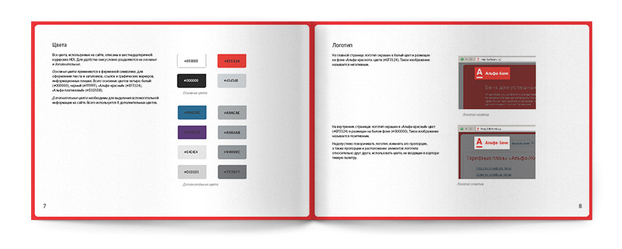


 Jimmy's Internet Marketing Business Blog