So there are tools available to find appropriate keywords. There’s a lot of different tools online that you can use. Google has what’s called their keyword planner. It’s right in Google’s under tools and settings here you come over here to planning and you can use the keyword planner and you can find keyword and AD group ideas.
You can get suggested budgets and you can find you know, search volume and forecast as well. So a lot of times we’ll be searching for a specific keyword or we’ll think. Oh, look. This keywords going to generates a lot of results. It gets a lot of activity, but then later we find out like the search volume, there’s some very low. So you can get all this information using the Google Keyword, planner right under tools and settings here.
So, let’s review the four targeted keyword, matching options to control which queries trigger hats. There’s four keyword match types that are important for you to really understand. If you don’t understand the different types of keyword match types, then you will burn that budget. I’m telling you you will lose money, I’ve seen people, you know waste tens of thousands of dollars just because you know they didn’t understand the difference between broad match and exact match.
” All right, so today, We have a special guest Alycia from Sucuri. Thank you so much for coming on today. Yeah thanks, I’m happy to be here Awesome, so we’re Talking about what is a CMS and which one should you Use for your website, Can you tell us a little Bit about what a CMS is So CMS stands for. Content management system and it’s basically an easier way to put pages, live on your Website or blog post manage your image media Library all that kinda stuff Awesome and now, let’s Go over the top three CMSs, I’m going to be a little bit! Biased in this episode, That’s my disclaimer right there, I’m going to start with WordPress WordPress is the most popular Content management system out there today powers Over 1/3 of the internet, It has tons of plug-ins tons of options and it’s pretty resourceful And probably my favorite Reason for why I use WordPress is the community behind it.
They’re such a large community that that just all comes Together, there’s meetups, there’s wordcamps and everyone just helps each other out For sure, and I mean with 40,000 plugins almost like you, have no end to the kind of functionality you can add to your CMS Absolutely. So what are some other CMSs that we can possibly use For sure, yeah,,’cause everybody’s heard of WordPress, so Yeah Drupal is another very popular one.
It’s been described to me as Kinda, like a Swiss cheese, you need to be a bit more Technical to use Drupal, but it does have a lot Of different features compared to WordPress, it has A different user experience and ultimately it’s been Used for a lot of things like government websites, And that kinda thing because of its ability to be a little more secure in some areas: yeah Yeah and it’s definitely One not for like the smaller business type sites as Enterprise or large Corporation type sites right, Yeah, yeah for sure Yeah Joomla – is another really Popular one as well, It’s got a really good.
Community – and it’s got, I think, the second highest Market share after WordPress, Although WordPress is Like 30 % – and I think, like It’s, a giant Joomla’s like 6 %, so just A little bit of a gap there between the top two but Joomla’s, also a really awesome CMS to use You wan na make sure that you’re using the most latest version. If possible, There are two active versions: Available that you can use Yeah, you definitely wan na stay on the most recent branch.
Of any CMS, if possible, Yeah that’s just a best practice there. All right. Let’s talk! About really figuring out, which one should you use right Like what are some of the first Steps we wan na think about. Definitely you wan na Make sure that you know what your requirements Are for your website, So how does it need to Be for your users to use! How are you going to go about? Actually creating posts and what are the processes that you’re going to use as part of that And then once you have all that you can kinda look at each CMS and see what are the extensions and Themes that are available And see if they’ll match the Requirements that you have for your website, That makes sense and It all comes down to figuring out what’s right for you Like, I will stand by WordPress all day, but WordPress may not be Right for your situations, Figuring out those requirements, With those applications are super important, Yeah and usually a Lot of the CMS websites have a great community Because they are open-source, So tell us a little about open-source Yeah for sure.
So all Those top three CMSs they’re open-source they’re, also free, which is very important, Open-source, basically Means that the source code used to build WordPress Or Drupal or Joomal, it’s all open and available, and anybody can contribute to it as well Right on So that just means it’s Constantly being improved by the community and the Community’s also checking to make sure that, what’s Being added is secure All right, so we want our Website to look good right, So is that something to think About when we’re choosing what platform we use and how easy it is to create those sites Totally so different themes will have different attributes like They may have a sidebar on the left or the right, Or they may be all one column in a never-ending scrolling website.
Different themes will Allow you to accomplish, maybe what you need by Having custom backgrounds or custom menus, so you Wan na look at the options for your theme and you also don’t wan na discount like premium themes, A lot of premium themes out, there will add extra functionality, So you’re, essentially Paying for the theme, even though the CMS is free, That’s an awesome option. There’s premium plug-ins as well, Depending on what you Need the default themes that come with it are Sometimes a little restrictive, so you wan na take a look at What the default themes are: Try some different free themes and see what the options are to get your site to look.
The way you want it to Yeah and what was kind Of controversial at first in WordPress and 5.0 remember Gutenberg, Oh yeah, Gutenberg is essentially The new WordPress editor, The whole point is to kinda mirror the printing press of just Blocks and everything else, Yeah, what you see is what you get So as you’re typing — Whizzy, wig, Yeah whizzy wig, Thank you So as you’re typing Yeah, you see exactly what you would see on the website, So that comes default by WordPress.
It has made the experience. Especially for first-time users easier to create, Then there are page Builders like Elementor or Beaver Builder or WPBakery Builder, that makes that user-experience A little bit easier, If you’re going on the WordPress realm and really want something: That’s pretty customizable, you don’t have to be a Web developer or guru to build that website For sure CMSs are having to Make things a little easier, You know, there’s a lot of Different places out there that are creating website builders that are super easy for people to use, and so it’s helpful for These open-source CMSs to make the user-experience a little easier All right.
So another thing we probably have to think about. Is the hosting requirements We’re going to need for our applications? Talk us through a little Bit of what that looks like For sure, so most of These are running on PHP, so you want the most Updated version of PHP, especially if you want The latest features and to make sure that you’re Getting those security updates? Yes, So that’s really important.
A lot of hosting companies will offer one-click Install for most of these major CMS applications, Some hosting companies Especially when I first started creating websites – and I Was on a super budget, but also a very secure host, it took me a long time. It took me like three days to install WordPress and they have a famous 5-minute install You wan na look and see, and maybe talk to your hosting company.
About what the options are for getting this CMS Installed on your server Right,,’cause, taking three Days to get a website going just the beginning is not Something you wan na do There’s a lot of places out there that will do managed hosting Especially with WordPress There’s managed WordPress that has just already automatically installed some extra security features And then what most people End up going with is like a cPanel type Hosting Since it does have that one-click install with Installatron or Softaculous, Whatever they’re, using Totally Couple of clicks of a button and then it’s there, You can start building and Designing, however, you want All right, so the real Reason I brought you on to this.
Episode is really talking about security with CMSs They’re open-source. You Constantly have to update them, so there’s lots of things. That we need to really think about to make sure Our stuff’s protected Totally well with It being open-source not only are all the good People contributing code, but all the bad people can Also, look at that code as well and find vulnerabilities. So that’s something that a lot of people are concerned about.
Especially with WordPress being so popular, it is a large target. The CMS itself is actually quite secure because there’s a great Community checking things out. You wan na make sure that you’re Not installing more plug-ins than you need Trying to make sure that you’re keeping everything up to date. If you have a managed solution, They’ll, do it for you, Which is awesome. Yup, You wan na make sure That you have something some kind of security plug-in That’s monitoring your site, letting you know if there is A problem that they detect There are some that can also Add features for protection like adding Two-Factor Authentication, which is a second password on your phone that you need to enter in Order to get into your website There’s all kinds of Cool security, plug-ins security utilities that You can use with your CMS Yeah, I know with WordPress the top security plug-ins That come to mind, of course, Sucuri has This security plug-in, but there’s also Wordfence And then with having an SSL on your site, super important just to Encrypt that password,’cause, you have to login The beauty with CMSs that You can access them anywhere right, Yup, So you wan na make sure that wherever you’re accessing’em Your password isn’t being sniffed out by someone in the middle Yeah.
You wan na, be careful. You don’t wan na. Maybe do It in like an airport or coffee shop, Wi-Fi Unless you’re using a VPN.’Cause, if you are sitting There on public, Wi-Fi and there’s a hacker sitting next to you, they could sniff your password As you’re typing it in And then the next thing you know, there’s a bunch of spam pages on your site that you need to deal with. So what about firewall? I’ve heard that it should be important.
Should be added to the site, What’s the validity with that? Definitely one of the nice things about a website firewall Is that it will virtually patch your CMS? So if There is a security issue, essentially the firewall’s Taking care of that, It surrounds your website. And if somebody’s trying to exploit a vulnerable Plug-In on your site, the firewall will catch. That attempt and block it They’ll see a blocking page.
Meanwhile, all of your legitimate Visitors are being sped-up because of the global Network of the firewall and content delivery network, So we’ve figured out what Cms we’re wanting to use We’ve got it installed, how Do we go about documentation, learning the program itself? There are some awesome Resources out there, You talked about WordPress WPBeginner has some awesome? Training guides and tutorials There’s an awesome community.
For all of these CMSs, with very active, like support forums, That’s a great way to go about it And then, obviously, if you have a developer, Or something like that, that’s helping you get some customization. They can usually help you. You wan na make sure that You’re documenting everything as part of your website as well, so It’s just going to help you Later on down the line, if you know you have a List of all the users, all the plug-ins and that kind of stuff and you’re keeping that up-to-date Yeah, especially if you Have people on your team that needs to access the site, Giving them documentation on What they should be accessing, what they shouldn’t be, because sometimes the wrong click can Make just chaos happen Totally and good user passwords making sure that you’ve Got the right role levels assigned to your users? Whether they’re just an editor or author or contributor Right Those roles are usually built into the CMS to allow you to make Sure they can only access what they should be allowed to access.
You only wan na grant admin privileges to somebody for as long as they need it, and that kind of thing Now, with this website, I know many of the entrepreneurs or even solopreneurs out there with their stuff, has Many hats to wear right, Sometimes maintaining it, isn’t always something that they have time for Yeah. It may not be top of mind Right. What should we be? Doing with those updates Yeah, definitely I would say that it’s very important to make sure that you always retain Access to your property, your web property, So I’ve seen cases where a developer will leave a client and Leave with the passwords and then you can’t get Into your hosting account, or you can’t into WordPress, It’s not ideal, so make sure you always have access to those things And make sure that you’re just practicing safe security practices.
Throughout all of it Right on and with WordPress and Joomla everything else, we Talked about it earlier, make sure you’re at least going in there every now and then to update It to the next latest version: It’s not only for performance, but it is for security Yeah for sure I mean with some CMSs there might be different branches that are still being actively developed So having a firewall That can virtually patch and make sure if there Are any vulnerabilities you have a little bit of an extra window.
‘Cause whenever there’s a Security update released, the hackers are looking going. “: Okay, here’s the old file; “, here’s the new file; oh look: “! There’s the security flaw!”, So it can be –. Then send all our bots out Totally it can a matter of minutes hours after a security patch is released before there’s active attacks in the wild So definitely update your Sites as soon as possible, Auto-updates are amazing, WordPress has auto-updates on most hosts, Yeah and or you can hire developers like most designers or Developers will have like a website care plan, so you Can them just do it for you, If you’re using WordPress, Godaddy ProSites or ManageWP has the one-click updates.
So you can update all your Plug-Ins and your themes, You even have a safe update option. So what it does is It’ll update your site, take a snapshot of before and after and make sure they’re all the same. And if there’s an issue It’ll retract, back to it It’s a free option for you Yeah, that’s perfect! You hit on a good point, It’s not a set it and forget. It thing with a website: You need to make sure that You’re maintaining it And that it’s part of your business, it’s how your business looks.
So you should definitely Make sure that you have some kind of plan for keeping It up-to-date and maintained All right. The last point that we should really talk about is really your time and investment with the CMS of your choice. Talk us through a little Bit of that about that For sure we’ll you Wan na go in and realize that it’s going to take you Time to setup all the pages that you want Right: It may take you time to find the right plug-ins, so you wan na kinda think through whether You want to hire somebody or get some help with that To find the functionality and the look and feel that you’re after Definitely budget when It comes to free CMSs.
Well, you don’t have to pay for the CMS. So that’s helpful Right! But it’s customization and security and all Those things that you definitely wan na consider as part of the whole package of having a website On-going costs for domain WHOIS privacy, SSL certificates, Right firewall, All that kind of stuff, All that good things Totally yeah, there’s A lot of accessories that go on with having a website, So you wan na figure like I said at the beginning what those requirements are And then make sure you have a plan for how you’re going to budget and the timelines around When you wan na launch Perfect and with Drupal And Joomla they are, they do have that smaller market share, So there’s really specific requirements of when you wan na use those applications.
Those developers that you hire for Drupal or Joomla might cost more than a WordPress designer as well For sure yeah, and you wan na make sure that you’re really looking at the work that the developer has done and make sure that it Matches what you’re, after There’s lots of great Websites out there that you know can tell you more About how to pick a developer depending on what you’re after Well? Thank you so much for Coming out on the show today and helping us figuring Out what a CMS is why we should use one You’ve been awesome Thanks my pleasure.
Well, if you liked this article go ahead and smash that, like button, add a comment below on Something that you’ve learned and subscribe to this blog and ring that bell, if you’d like to see these episodes first, This is “ The Journey.,” we’ll see you next time.
Who is helping with your digital business footprint?
”, My guest is Dave. Crossland He’s the program manager For Google Fonts And today we’re Going to be talking about the state of web fonts –, what are they, how to use them? Effectively and what’s new, Let’s get started, [ MUSIC PLAYING ], So Dave. Thank you. For being here, My first question is: About why web fonts, What do they bring to a website? Beyond the standard fonts like Helvetica DAVE, CROSSLAND Well, Web fonts really express a certain kind of Feeling for organizations They express a brand And you can have a web Page without a article, but you can’t have a Web page without text You have to have fonts And so a brand at its core Would be like a logo, a color and a typeface or a font, And so web fonts bring The kind of rich design that we have in print Media to the web, RICK VISCOMI And according To the HTTP Archive nearly one third of Websites use a font from the Google Fonts API, So why are developers turning To the Google Fonts API DAVE CROSSLAND, I would say That Google Fonts is fast, easy and free And so on.
Our Analytics page we’ve clocked up over 22 trillion. Font views in total since the service Launched in 2010 – And I think that being on Google’s content, distribution networks, we benefit From cross-site caching, So when you visit the First website that uses a font like Roboto, it’s downloaded and you may see Some latency there, But then on all Subsequent websites, which use the font From Google Fonts, then it’s in a cache And loads instantly across the different websites, We also try and Make it really easy So the font’s API Abstracts, a lot of the complexities of web Font technology from you, So we serve different formats.
To different browsers, For example, with better Compression formats, like WOFF2, only the newer Browsers support those, And so we serve WOFF2 files. To those newer browsers And we serve other Formats to older browsers And then finally We make things free and we have a directory of Hundreds of choices which everybody can choose from Now, of course, if you Want a particular typeface, then it may not be Available in Google Fonts and you would go and license That font for your usage, But not everybody, has the Sophistication in design or the resources To license fonts And I think it’s important That everyone in the world is able to do typography, RICK VISCOMI, So I don’t Know if developers truly appreciate how complicated Web fonts are under the hood.
I got a taste of this when I Was at YouTube a few years ago, I helped change the Default font to Roboto, and it was not as easy as just Changing the font-family CSS style, There’s a lot you need to do to Make sure that it goes smoothly for the users and they Have a good experience, For example, like YouTube users, Are from all around the world, They have different languages. Different alphabets, What are some of the Things that developers need to be concerned about For an international audience, DAVE CROSSLAND International Users face a challenge because the file sizes Of fonts, for them can be larger than just For European languages Traditionally Google Fonts has done a kind of slicing of Fonts into language or writing system sets, So we might have, for example, Latin Latin Extended Cyrillic Cyrillic Extended Greek Greek, Extended and Vietnamese: That’s your current support for Roboto that’s used on YouTube.
We also support Other languages — Hebrew, Arabic, Thai, Many different Indian writing systems And the biggest Challenge has been for Chinese Japanese And Korean fonts, A typical font for Indian languages can maybe be two or three times Larger than a European font, But for East Asia it can Be a hundred times bigger And so we’ve been able to Use a number of technologies, for example WOFF2 Compression which is now a W3C standard this year, And also the @ font-face Css has a new aspect called unicode-range.
Unicode-Range allows us to Slice, the fonts into pieces, dynamically And the browser will Only download the pieces that it needs, So that means that We were able to slice a Chinese, Japanese or Korean Font into over a hundred slices And therefore the Latency of each slice is similar to your European font, This means that the experience Latency is much better And because the Slices are cached across different Domains then the font gets faster and faster To load over time, RICK VISCOMI Custom fonts have Also been used for icon fonts to show images And more recently, they’ve Been used for emoji as well, So we’re moving beyond just Text and on to these other ways that we’re using to communicate, But it’s not without its Own challenges, right, DAVE, CROSSLAND, That’s right! Font technologies are always Improving and evolving And the use of emoji as a kind Of special case of icon fonts is particularly interesting.
I think that there’s a Debate in the web development community about how To best approach this Using images for icons, whether That’s PNG or SVG vector images is –. There are some advantages there. One of the advantages To using icon fonts is that aligning icons with Text in labels is often is a common use case And getting the alignment Onto the baseline of text can be tricky when You’re dealing with two elements: — a text Element and a image element And so icon fonts can Play a good role there.
They also have good legacy. Support because obviously text systems work everywhere. Unfortunately, for Emoji and color fonts that’s a little bit. More complicated because there are Different color formats for different platforms, And so one font file needs To have a lot of data to support all of the Platforms at once And they can look different On different platforms, So yeah emoji as web fonts Is still I think, kind of — is a cutting-edge thing, But it can add.
Consistency – and I hope we see more developments – Of that in the future RICK VISCOMI And going Back to the Roboto at YouTube example: one Of the things I remembered that was kind of tricky Was when we would have font-weight bold in our styles, That would default to Weight 700 by the browser, But our designers decided that It looked best as weight 500, So we actually had to go back. And change all of our styles from font-weight, bold To font-weight 500 And it became kind Of a new way that we had to ingrain into Our style development, But there’s something new.
That’s Coming out called variable fonts, How would they help Address the situation, DAVE, CROSSLAND, Yeah Variable fonts can help a lot. It’s a very exciting. New technology, It’s part of the Opentype standard, which is the font format that that’s Widely supported in pretty much all platforms today And variations allows you To do runtime interpolation between different sort of styles, Or faces within a font family, So traditionally you would Have like a thin weight, a regular weight, a bold Weight and extra bold weight And in CSS you’ve only Had up to nine weights — 100 through 900 With variations, then you are Able to specify weight, 154 and dial in a very specific And dynamic weight You can animate these weight.
Changes using CSS animations And in CSS4 there’s more Direct support for this RICK VISCOMI So does that Mean that every font is now going to be able to be Completely customizable, Or are only a few fonts going To be eligible for this DAVE CROSSLAND Well, it is something that font developers Need to add to fonts, And so in that Way it breaks down the traditional wall between the Font maker and the font user And so variable Fonts create a kind of dialogue between the two, So as a font user, you Can customize the font, but only in ways which the Font maker has provided for, And so that means that you don’t Need to become a type designer yourself, but it means that you Have that flexibility that you didn’t have before And the variations are Not only for font weight, There’s, also font width, There’s slanting And there’s also optical size, And those are all part of The OpenType standard today Optical sizing, means that When you change your font size from 10 point to 70 Point then, the letter forms will actually react and Respond to that change, And so, as your font Size gets larger.
The letter forms will Become more elegant And as it gets smaller They can become more legible, more readable And there’s also all other kinds. Of variations, you can imagine, which aren’t part Of the standard and are specific to each font, Things like rounding and many creative options. Google Fonts is commissioned. To sort of experimental trial fonts from type designer David Berlow at Type Network.
The first is Decovar, which Has a lot of variations which are decorative so rounding Different kinds of serifs different kinds of Stroke patterns And this can be used as a Kind of graphical device, Because variations Can be animated, I think there’s a lot. Of potential there, The other typeface is Amstelvar And Amstelvar is A text typeface and it has a set Of parametric axes which go far beyond Just weight and width and into things like The ascender length descender length and A lot of variations which can be used together, To create more readable text, RICK VISCOMI, I’m Especially interested about variable fonts, We’re going to have to Have you back on the show once they’re a little Bit more established, Then we can talk about The state of them, But where could Developers go if they want to learn more about Any of these technologies DAVE CROSSLAND Microsoft Edge has on their developer site a Really good variable, fonts demo site That’s a great place to learn.
More about variable fonts, There’s also the Design.Google.Com/Fonts articles website, where the Google Fonts team publishes articles about type and Typography in collaboration with the Google Design team And then there’s Also material.Io, where you can get the Material Design, icons, font and learn more about Material Design guidelines, RICK VISCOMI, Well, there you go, The links are in The description so go check them out.
Share your web fonts stories. In the comments below Don’t forget to Like and subscribe so you can tune in For another episode of “, The State of the Web” Every other Wednesday, Thanks for reading and We’ll see you next time, [ MUSIC PLAYING ]
It’s good. Did you get a haircut? I did a haircut new accent, new new new. Look. You feel it’s good! It’s good you’re, looking better than before. You feel better than before. You’re, not mad. I am NOT no hi, I’m Rob Dodson, I’m a developer advocate on the chrome team, sure Rob just just sell, sell yourself. I mean hello and also uh you’re selling stuff, also host a little show on the chrome Developers.
Youtube blog called alley cast world-renown. Is that what we’re calling it yes well world renowned, I see people around the world have renowned it. I think, okay, all right, believe what you want to believe, but today we’re going to be talking about accessibility, audit, Angley right. What is your workflow for that? Look? Like yeah, so over here on, my laptop I’ve got a site that I’ve been working on.
This is called lifestyle. It’s got some cool like hipster photos and stuff, like that people have styles of the accessible and famous all right yeah, and what I usually do when I’m you know working on improving the accessibility of a site is, I will use the new audits panel in chrome, Dev tools, which is very very nice if you go to create a new audit, you’ll, see that you’ve got like a number of options inside of there, so you could look at PW, anus, best practices, etc.
One of the topic areas is accessibility, so you can just go run, just an accessibility audit. If you don’t, you don’t feel like doing the other tests. Here’s one that I ran against the page and it’s doing pretty. Okay right. It’s got on anyone not so bad, but there’s definitely a few issues that we need to fix and in particular one that I see a lot is, is color contrast, so you’ve got your your your foreground text.
Maybe is a little too light on the background. Color one of the nice things that we can do with the audits panel is we can actually dive in and we can see which elements specifically have failing contrast. So here I can see that I’ve got this like product card price element and if I click on that and stretch this out a little bit, you can see. It’ll take me over to my elements panel and I can actually scroll in to view the actual element that is failing just this price right, y’all, nice and it already selects the domnode for you, that’s cool, yeah, and so one of the things that’s really helpful.
Is you know really this is this? Allow me to sort of quickly identify this node, but one of the things we’re working on, which is over here in Chrome, Canary right now, is actually a color picker. That will make it a little bit easier for you to fix those contrast issues. So if you’re in something like Chrome Canary, you can go into Chrome, colon, slash, slash flags, you can look for the word: developer tools, experiments, oh you’re, in flags and experiments.
You look like to live dangerously, oh yeah, oh yeah, so dangerously, so we enable the developer tools, experiments right. We step into the future, it’ll refresh our browser for us. We can go back over here pop up in as the dev tools click on this little Settings. Menu good, where it says experiments da da and here we can see, we’ve got accessible the inspection as well as color contrast ratio line.
So let’s see what that does so we’ll go, find that same node. That was giving us problems over here. Inspect it and then we can see in our Styles panel I got a little color sread and click on that and you’ll see that there’s this little line inside of my color palettes. This is actually a sea mmmmm-hmm. This was actually telling us like. Where are our colors needs to be in order to have sufficient color contrast? So, since we’re above the line, we get this little warning that says, we’ve got a little contrast.
I happen to know that this is not like the final look for this piece of UI. It’s still being iterated on, but it’ll be something like this, where you’ve got a line and you can sort of tell which side is the good side of the bad side. So I can actually just drag this below the line. That warning goes away. You can see over here. It’s also like updating my element live in the document and it’ll sort of tell me what the good color contrast ratio is.
So I can just grab that value right off here and then go back and just fix it in my CSS. That’s pretty neat, so I was trying this out the other week and something that occurred to me was that you know if, if you use a developer, realize that the contrast is a little bit off, do you need to go back to your designers at that point, And say: well, is this okay for our brand and thing is that’s when they should be factored in earlier on in the process I ideal.
Yeah like this is there’s, there’s definitely other design tools out. There there’s, I think, there’s plug-ins for sketch, and things like that, which will also help you look at the color contrast for your designs and make sure things are not too low. Contrast, anytime, you can catch that earlier in the process, make sure all the designers are on board and all the stakeholders are on board and and that sort of like makes it easier when those things come downstream for folks to implement it, and it doesn’t kind of, Like a contentious issue or anything cool, that’s that’s awesome.
The house audit also had some other accessibility stuff in there as well right. So it had contrast. No, I was highlighting all the tributes to alt attributes, yep yep, so yeah. If we go back to that report, let’s see here so yeah a few of the things that that this site was failing. It’s missing some alt attributes. We’ve got form elements that don’t have associated labels: the big problem there is you land on a control, and maybe it says that it’s a button, but it doesn’t tell you what kind of button right is it the you know, sin my social security number to hackers Button, I don’t want to click that button right.
I want to make sure that I’m clicking the right kind of controls. I know what I’m interacting with we’ve got over. I think 32 tests, or maybe even over 35 tests in in the lighthouse accessibility checker here and under the hood. These tests are all based on a library called axe core which is made by some folks at a DQ so yeah. We we work at the axe, core library we leverage to the test from inside of it and we sort of integrated into dev tools.
You can hop around and inspect the notes. Real, quick, that’s awesome, so this is great again for locally checking on your accessibility issues. What about CI and continuously monitoring your accessibility? Is there a story for that too yeah? Absolutely so the the lighthouse library itself can be used as a standalone node module. So you can pull that into your CI process. If you want to do that or alternatively, you could use the axe core library that is powering these tests and you could use that standalone.
The the nice thing there is, you can sort of decide which accessibility tests you want to turn on or off, depending on sort of the criteria that you’re trying to meet very cool. So we’ve got lots of great tooling for accessibility, auditing. What about docks or education material? Yes, we have that as well. So if you go to developers.Google.Com/live Sunda mental, slash accessibility, we have a whole section there on getting started with accessibility for the web, and it also includes links to our Udacity course.
So that’s like a multi-week kind of hands-on experience where you actually like build stuff and read a bunch of articles and kind of get up to speed on accessibility, very cool yeah. I feel, like my lifestyle, is more accessible, already yeah cool yeah, thanks for having me today, yeah thanks for coming down awesome yeah people should check out ala cast: oh yeah, oh yeah,
My guest is Brad, frost, web designer and author of atomic design and today we’re talking about Design Systems. Let’s get started so Brett thanks a lot for being here. Thanks for having me, I want to show off by asking you: has the metaphor of a web page exceeded its usefulness, yeah, it certainly has, as what designers we’ve been thinking about.
The web is in terms of pages for a long time right, it’s been with us since the web’s beginning right. We scope things out in terms of pages. If things don’t load in the browser says this web page hasn’t loaded and that’s had a really big impact on sort of how we structure our teams, how we scope our projects and how things are actually executed from from a web design and development standpoint. So, for instance, I work with a lot of large organizations and so they’ll have a team, that’s responsible for the home page and then they’ll have a team, that’s responsible for the product page and another team, that’s responsible for the checkout page and all of those teams Are doing things sort of independent of one another right, because they’re just focused on this notion of pages and as it happens, all of those pages are actually made of the same stuff right.
If we were to break things down, you have buttons, you have form fields. You have blocks and cards and heroes, and all these other things – and we end up with whenever you have these different teams working on different pages and thinking about things. In that way, you end up with you know one button looking similar but different than the next team, that’s working on the next page and so on and so forth, and you, you know, repeat that a number of times and span that out over a number of Years and you end up with a giant mess on your hands, it’s not to suggest that we should stop using the term.
It’s probably still useful for users. Yeah only see things as a flat page, but from a design and development perspective. It’s kind of updated yeah. Yeah, that’s right exactly it’s it’s! It still comes together as a cohesive whole and I think, that’s important, especially as people get into talking about design systems. A lot of people have a big misconception that oh design mean you just sort of isolate things at their component level and just designed the button and just design the sort of headings and just designed the card in isolation.
But that’s just not true. That’s you know. It’s important to sort of realize that yeah things do all of those components, do come together and form a cohesive page at the end of the day and that’s what the user sees and interacts with. So it’s important. It’s not an either-or thing, but we just have to be more considerate about how we make the parts of that page as the web and technology as a whole progresses forward.
How has that changed the way that web designers think about serving pages to users and the ways that the websites are accessed yeah? Well from like an access standpoint or from like a design and build process? The fact that a user could be I mean even these days like accessing the web from their refrigerator. You never know the form factor or anything about the user’s device. You can’t make any assumptions: yeah yeah, that’s right and again it’s gotten really complicated and that’s why I think design systems have become as popular as they’ve been because the devices haven’t slowed down right.
The device proliferation is still happening right. The number of contexts – and you know, screen sizes and form factors and, and you know, yeah native web embedded devices different screens. Different sort of you know. Mouse and keyboard touch inputs, and you know voice and, like all this. Other stuff is just the amount of things that users have or that that designers and developers have to consider as they’re, creating user interfaces and creating these experiences I’ve just sort of accelerated, and we can’t keep up right.
We can’t create bespoke pages, for you know: here’s our small screen view and here’s our tablet view and here’s our desktop view. It’s it’s so we’ve had to sort of pull back out a necessity just because we’re on the hook to deliver more features, more services to more users and more context using more devices in more ways than ever before, and it’s like unfortunate. Our budgets have been increased and our resources haven’t increased with that same sort of exponential curves.
So that’s what’s like sort of forced us to sort of step back and and reconsider how this all gets done, given that there are so many different viewport sizes and everything does that mean that the flat Photoshop file is no longer very useful as a means of Conveying the design, yeah, yeah and and still to this day, I’m working in if Photoshop might be a little long in the tooth when it comes to web design, but same thing happens in sketch in figma.
Just last week I got from the clients designers, you know a mobile version of the comp and a tablet version of a competent desktop version of a comp and and a lot of that’s just sort of wasted effort. Really because all three of those things in isolation are sort of one they’re already alive, because it’s a picture of a website not an actual website, but all those spaces in between is where things really fall down right.
You can sort of paint a picture, especially in a in a static design tool where there’s artboards and you could just sort of move things around in free space like that’s, not how things work in the actual browser right. There’s things like some order considerations and all that you can’t just sort of go on this side screen. I just want to move this from here to here, or this I’m just going to swap this around it’s it’s.
It’s really important to sort of make sure you’re. Considering the actual medium that this user interface is going to come alive and and do that much sooner in your process, I want to ask you about concept reviews before called design Det. What does that mean, and how do you avoid going design bankrupt? There’s no design debt and design bankruptcy. I’ve never actually heard design bankruptcy. Before I like that, I I think a lot of places could declare its design bankruptcy.
I think you know just when it comes to design debt. It’s you have. You know number of teams working on different things and just those we were saying you know working on different pages or different products right across a company and you sort of can can take a cross-section and sort of see a lot of discrepancies. Just in that. But that’s just one moment in time when you stretch out that process over time, especially products that have been around for a long time, the googles of the world or eBay or whatever it becomes like a little sort of Benjamin Button.
Like experience as you click through pages, you get further back in time in these older crustier user interfaces, you’re like how did I end up in 1999 and all of a sudden? So so I think that that’s sort of that sort of that visceral feeling of design debt where it’s like you have all of this sort of old stuff that was created. It’s you know once upon a time and that whenever that was launched, it was the new hotness and the new hotness becomes the old crusty experience.
You know pretty quickly these days right so so I think that the more sort of deliberate and the more sort of systematize you could sort of control and wrangle all of those those sort of user interfaces that are, you know out there in the wild. The better. Your chances are going to be as sort of like reducing that that sort of design debt and that’s again, I think, a big crux like that. The crux of design systems is to sort of help.
You know eliminate that debt to basically take those $ 19.99 designs and say: okay, we’re going to update them with a new design language, but we’re going to do it in a very sort of systematic way so that the next time we do a big redesign. We have actual hooks in there that we could actually sort of lift up the quality of in you know so to evolve that design language like flip the switch and roll that out to a bunch of places, sort of simultaneously or or in very short order.
Instead of like, oh, we have to do this big monolithic redesign, and we have to do that for each of our products again and again and again so the developer experience must be a lot better when you can have like a single source source of truth. For your design, but also the user experience as well, could you describe like what it might be like for a user to be on a site that has designed yet yeah? I mean it.
This happens all the time I mean so. The e-commerce example is a great one, just because I think that you know ecommerce sites, you know super sexy homepage or the super splashy super current right. It’s like it’s got the latest. You know shop fall trends, their shop Christmas like coming up or whatever. That’s like you look very campaign driven. So it’s often like a very modern experience. You sort of like click into like that.
Maybe a product detail page or a product category page that sort of feels modern ish. You know it’s like sort of a little bit more meat and potatoes like e-commerce stuff. So it’s like those templates sort of probably feel pretty good, but then, like you, might get to the shop card or if you like, actually log into your account, it’s like those things feel way different and and then you get to the checkout flow.
And then you know that might be sort of way long in the tooth or it might be sort of built by you know an external vendor or something because they’re processing, credit cards and stuff like that. So it might not actually be integrated with like the rest of the site at all. So what ends up happening for? Why that matters from a user experience standpoint? It’s not just about other things, look different like because who cares as long as that’s effective, then that consistency shouldn’t ever be like the number one goal of any of this, and I think that that’s when we talk about Design Systems, I think that’s another misconception as That, oh, we just want everything to look the same everywhere and that’s just really not true, because if your metrics are doing well and stuff – and you know the buttons look different on the checkout page then on the the product detail page, then that’s fine right! No harm no foul, but the problem is, is whenever you’re, a user and you encounter say a date picker or something – and this is a favorite one of mine just because those are hard to build so often times developers just sort of go and grab something.
You know a library they find on the internet somewhere and if you’re, you know say like at an airline or a hotel chain, and you have four different developers grabbing four different date – pickers across the site. Now, all of a sudden, every time the user needs to pick a date, they have to relearn that new library and that, even if it’s just fractions of a second or a second or two or the, where they’re like oh wait, I’m used to booking from the Homepage, but this is a different convention that slows down that process right and that has a negative hit on you know, certainly when you’re talking about you know booking flights or hotels or something that’s going to cause it dip.
So that’s sort of consistency from a user experience standpoint right that ability of like oh yeah. I’ve encountered this pattern before and I know how this works. So I could just sort of roll on and sort of fill things out a lot faster or interact with this thing faster like that’s. That’s what we’re after right, so that consistency for consistency sake not so much, but consistency from a you know, sort of mapping to what users are used to already like yeah.
That’s, that’s! That’s where it’s at one of the people, problems on a design and development team is not sharing the same vocabulary or calling the same components: yeah consistent yeah. So what are some of the problems of that? And how can designers and developers get on the same wavelength? Yeah, so that’s one of the biggest things that I encounter is as an one exercise that I like to do with design development teams whenever I’m working on design systems with them is right out of the gate, we conduct what I call an interface inventory, so we Basically go across their entire sort of suite of products, or you know, whatever user interfaces could be served by their design system and and sort of divvy things up is like okay, you go hunting for buttons, I’m going to go hunting for sort of.
You know input fields or whatever, and then we sort of do that as a group and then what we do is we get together and sort of present what we found to each other and that’s where it’s really fun, because, especially whenever you have designers in the Room developers in the room, QA engineers, business people in the room right like the product owners, like all these different disciplines and you actually sort of have to articulate what your UI is right.
So so somebody will get up and it’s like. Oh and here’s this admin bar and then somebody gets admin bar. We call that the utility bar right and then the developers are like. Oh, we we just mark that up as the gray bar right, and so it’s like. Okay, there we go right. You got everything out on the table right, these inconsistent names for the same thing, and of course that means you have to have again just like that sort of user experience you have to like slow down.
You have to have have a meeting to figure out what you’re going to call this thing like, and you know a lot – can get lost in translation in between design team or different disciplines, but also different teams in general right. If team one is calling it a certain name and team, two is calling it something else. That’s a big deal right, so so again, so bringing this all back to Design Systems. What that it, what a design system can do is sort of centralize your sort of UI patterns call them names right, give write guidelines around them, so that everyone is like, literally speaking, the same language right.
They know what you mean when you say utility bar, and you know how to use it where it’s useful, but also crucial. One of the other things that we found really valuable in in creating design systems for clients is here’s. What this thing is: here’s where it’s useful, but also maybe here’s some gotchas or here’s where it might not be useful, and maybe you want to use this other thing. Instead, what are some of the trade-offs of investing in a bespoke design system versus taking something off? The shelf, like a bootstrap yeah, that’s a big one and I’d say it’s tough, because tools like bootstrap and material design are already made.
They’re they’re, they’re well tested right, they’re in use by giant companies like this company called. Have you heard of Google before it’s like? It’s pretty big one. It sounds familiar yeah, so so a lot of these people right who are using tools like bootstrap and material design, they’re like oh, this has been tested by these. You know giant companies, so I could just sort of grab this and go and I don’t have to do all that work myself and that might be true and there are sort of instances of that um.
I think one of the big things that is important to sort of recognize and consider whenever you’re reaching for these tools is that it’s like you, don’t own it and it might be attractive from sort of you know, inefficiencies sake at first but as time goes on Right at the end of the day, your boss or your you know your product owners or your clients or whoever they are they’re going to say. Oh, we need to do this this way or we need to add this feature and all of a sudden, you’re you’re.
You have to learn and become sort of fluent in this other sort of system that you didn’t write, so so it can work and you can do things and extend things and customize things that works with the grain and these frameworks, but oftentimes. What I found is I work with clients that end up sort of working against the grain and they end up having to sort of undo a bunch of stuff and write a bunch of other custom stuff.
And then they end up in this sort of like weird messy middle ground, where it’s like. This is our sort of hacky stuff that we’ve done to sort of make things our own. But then also crucially, I’ll say that, from like a more of like a front-end architecture standpoint, I think that it’s sort of like safe, you know you got good bones to build upon, but like material design and boots actually offer a sort of anesthetic right.
They provide anesthetic and that could be helpful because again it’s like oh here’s, some good, looking buttons, here’s some good, looking form fields, here’s some good, looking components that I could use, but if Nike Adidas Puma, if you know Reebok whatever, they were all to use bootstrap For their redesigns, they would look frightening Lee similar right and that’s sort of not what they’re going for so there’s like there is this sort of branding aspect of it right this own ability that sort of gets lost whenever you’re sort of all using the same thing.
What are some of the challenges or unsolved problems of design of design? I mean I, I think, sort of specifically to design systems like a lot of there’s some things that are around sort of you know, tooling, and sort of figuring out how to keep design tools and tools, expanding quiff. You know what’s in code, that’s definitely one of the most. I feel like tangible sort of problems that but there’s a bunch of teams, doing a lot of work to try to solve that and startups and stuff that there are really exciting.
And so a lot of them look promising. And I don’t necessarily think that that’s you know far and away the biggest problem. That’s out there. I think so. Many of the problems with with design systems have to do with the sort of people have to do with communication and collaboration and sort of figuring out like how do we get this stuff adopted into our products right? How do we sort of communicate when things aren’t working as planned like? How do we sort of you know, establish solid processes for releasing new versions of the design system and letting everyone know like here’s one? You want to use the design system or here’s one.
It’s sort of safe to sort of you know, deviate from that system or build upon it or extend it, and how do you roll that back into the system? So a lot of that sort of coordinating a bunch of different people who are all suddenly relying on this, this design system product that stuff, I feel is – is still very tough to crack because it involves people and your you know the health of your your you Know design and development culture and like how well everyone sort of you know, collaborates together and like, of course, that’s that’s tricky right, so you could like you.
Could I could say things like here’s how I would create a governance plan for a design sister for a design system and here’s how I would you know, get these teams to work. You know and communicate more buts and you know easier said than done. Okay, so how much of a design systems success depends on the designers as opposed to the developers? What is their role in the success of it? I think, and – and this might be a little controversial design systems is sort of an unfortunate name because design systems are like.
Oh, this is about design, and it’s really not. The design system is, as I define a design system is, is how the official story of how an organization designs and builds tadaryl products and there’s a lot of ingredients to that story. And yes, like the design language, you know what what the brand colors are, and you know the the rounded corners or not of the buttons and stuff like that sure that that matters.
But that’s actually like a pretty tiny slice of what a design system entails, and so so when it comes to the success of a design system. So much hinges on that design system living in code and living as a thing that engineers and developers can sort of pull down into their application and sort of you know import a component and sort of see that design systems button or whatever show up on their Screen and then they’re able to sort of you know pipe in whatever sort of attributes and click handlers and whatever to sort of make it.
You know, breathe life into it, make it real, but you they sort of get that stuff for free right. If all you have is like a sketch library or some like Zeppelin file or some like like little, it’s a style guide thing where it’s like: here’s, our colors and here’s or whatever, like there’s so much that gets lost yeah if all the developers are doing is Like copying and pasting some hex codes in there, you know sort of crappy like development environments, and it’s just you end up with a bunch of spaghetti, even if they’re all using like the same color blue.
It’s not like systematize right. So what you want to get to is, you want to say like if we change our brand color blue – and this actually just happened on a project of ours – got a brand color blue and actually it wasn’t passing the accessibility level that we wanted, and so they Actually had to sort of you know: tweet the the color blue in order to make that sort of pass. You know because sort of cut the accessibility, mustard and with a design system like you literally, have you know a variables file or is these design tokens? You sort of tweak that value there and then that ripples out to the entire sort of design system right and then that gets packaged up in a new release of the design system in code.
And then you know next time the developers pull that down. Those sort of get and see those updates, so so, coming back to it’s like yeah, like the design language part of it, like the look in the feel of it that matters, I’m not going to say it doesn’t matter, but it’s almost just like you’ll, like do Your thing make it look good like I, you know. I trust you be systematic about it right. Thinking about motifs that are going to sort of like you know, translate well the different components, but, like so much hinges on like getting that stuff into a place where it’s consumable by the actual sort of you know, environments that users will be interacting with your products And that’s what we spend, probably the overwhelming majority of our time and effort on is actually like building out those libraries with components right, an HTML, CSS JavaScript.
You know bundling that stuff up and like sort of working with development teams to make sure that they have what they need in order to use the system successfully. So, to what extent should a design system anticipate the chaos of user-generated content like errors and long names? What is the actual like breaking point of a design system yeah? Well, I think that the breaking point of the design system has everything to do with how well you consider all of that stuff right.
So if, if it’s user-generated content that you need to account for and you’re in your UIs, then you have to you know, consider things like character limits and things like that. But you know there’s many other flavors of that as well. You know internationalization right, right-to-left languages or just you know, German will wrap onto multiple lines, and things like that – and this is where I think again – sort of designing and building components in isolation is a bad idea because you could sort of you surf fall into the Trap of saying like well, here’s this like perfect scenario where you know everything’s filled in and the card has this nice sort of you know image I found from unsplash and it’s like really nice.
Looking and you know, as it happens, the users name is Sarah Smith and Sarah doesn’t even have an H on it, so it just fits so nicely onto one line and of course, the reality of of our user interfaces is anything but that, and this sort of Also comes back to like the trap, was sort of relying on these sort of static design tools to sort of handle that they’re up until very very recently, there weren’t even conventions in place to sort of handle like dynamic data, so that’s sort of how we handle That this is where atomic design as a methodology – I think, really shines.
So what atomic design does is basically helps people consider the whole the pages, the actual product screens in various states and configurations, as well as the sort of parts of that hole right. So the underlying components that build up those screens and at the page level of atomic design, what we’re able to do is articulate here’s. What our homepage looks like with this. You know the fall campaign with the leaves – and you know this tagline and this call to action button that takes people to this and and whatever, but then you’re also able to say, okay and then here’s what this that same page looks like in German or here’s.
What that that same page looks like with you know the Christmas campaign and oh that’s, sort of image that we’re using that has a bunch of Christmas ornaments that actually is sort of you know, impacting the the readability of the text. That’s sitting over that image or something like that right, so you could start seeing where the UI starts falling down and then what you’re able to do is is sort of take that and learn from that and sort of go back to that hero component.
At a more atomic level and sort of say, okay, we’re going to maybe add a variation of the hero component that adds like a little gradient overlay so that the the legibility of the text always sort of you know pops over the the image a bit more. So how we sort of do things like in our own workflow, with that we sort of will create sort of you know, try to represent the whole bell curve. So it’s like what does a card? Look like what does sort of like a kitchen sink card? Look like with like the maximum character count that you might be able to sort of upload as a user or something or what happens if the user uploads the profile picture, what if they don’t right, and so all those various states and sort of you know, mutations Of the other component, so to get that sort of commonly used case down.
Of course, as like a starting point but like you really do have to represent like here’s, the extreme and here’s the empty and sort of everything in between as well and the only real way to test. If that actually works is by sort of plugging in real products and Aereo’s into your user interfaces and by sort of having that best sort of atomic design system wired up where, like the pages, informs and influences the underlying components, you’re able to sort of make changes To those components with which, then, you know, inform and influence that the actual page design, so it’s sort of like a virtuous cycle between like the design system and the pages and screens that that system builds.
Finally, what resources would you recommend for people eager to learn? More about design, Cisco there’s a lot I feel like. I have a hard time, keeping up with them anymore. There’s a there’s a number of really great resources, one that I help maintain is a resource called style guides i/o, which is a collection of, I think, we’re over like 200 50 examples of public design systems and style guides that are out there in the wild as Well, as sort of talks and books and resources and tools around a design system, so that’s just like an open source resource repository that people contribute to and sort of, submit poor requests to.
There is design dot systems which is maintained by Gina Ann who’s done so much work for the design systems community. She has a clarity conference, which is a conference dedicated to design systems. We have a podcast, which is a little bit in hiatus, but where we interview people that work at different organizations who have spun up their design systems and what they’ve learned and sort of you know struggled with as they’ve as they’ve done it.
Stu Robson has a really fantastic design systems newsletter. That’s part of the design, dot systems, sort of universe there and then there’s also a slack group all about design systems as well. So I’d save it like that sort of has me covered for sure and again there’s like a lot of activity there and new stuffs happening every day and people are learning from things you know from each other and plugging them in at their organisations and sharing what They’ve learned and like that’s really for me, the most exciting part of all of this is just sort of you know.
Here’s some concepts here are some things that we’ve found useful share. Those people take them, learn from them validate or invalidate them and sort of share. What they’ve learned and then everyone benefits from it, so your book is also available for free to read online right where it is yeah yeah, so you could read it at atomic design. Brad Frost, calm great breath. This has been great. Thank you so much for pyrite.
Thanks so much for having me, you can check out the links to everything we talked about in the description below thanks for reading, we’ll see you next time.
We have different devices. Different needs even different data requirements, and this is at the core of the PWA attitude to building for the web. We need layouts and content that work across devices if your site doesn’t adapt to the user’s device, you break the illusion and lose trust.
These quotes are from Brad, Frost and Liza danger. Gardner. You should check out that blog post about responsive design, which are linked to from the course materials as Liza says, manage risk focus on content. You know you can make virtually any site usable simply by sizing elements and content correctly. The golden rule for great progressive web app content is not to let content inadvertently overflow horizontally, especially on mobile.
That sounds basic, but lots of sites break this rule by making images inputs and other large elements on the page with fixed sizes. Using relative measurement units and RAM percentages will reduce the severity of this issue. Adding a meta viewport tag will also solve a lot of problems. This tells the browser the size of the virtual viewport on which it renders a web page without setting the viewport meta tag correctly, most browsers scaled down the page to fit a virtual 980 pixel wide viewport.
I’ve seen some great examples of this in action on w3schools, we’ll give you the URLs for that in the course materials. With this article, the initial scale value sets the zoom default. For this page, don’t set a maximum value that will make it impossible for users to zoom and that’s a big problem for accessibility. One other thing you should be aware of the viewport meta tag will mess up the layout for fixed-width sites.
The Mater viewport tag is designed to work with responsive layout. If you use it in a fixed sized layout, it will break things until you convert the site to a responsive, lay out trade document.Documentelement client to see how the viewport meta tag affects the virtual viewport. Here’s another simple technique: this solves many layout problems, you’re setting the preferred size and the maximum size and works for article and audio too so yeah.
You might think that relative sizing would fix everything, in fact, for a while back in the day, some of us thought that relative sizing could solve everything we layout. We had, you know liquid layout, maybe even text could be relatively sized, but relative sizing isn’t enough simplistic. Relative sizing, like this a diagram, means that you have content areas that are too big on desktop and to smaller mobile.
This is why media queries were invented. It’s a simple concept, use different CSS for different sized viewport based on width. That doesn’t just mean making the same layout for every device on a phone. You might want a single column layout, a two column layout on a tablet. Maybe three columns for desktop and so on. You can use media queries to select different layouts depending on the viewport size, here’s a single column layout on mobile to column, on tablet and three columns for desktop.
So do you think about devices, and you might think you could get away with this? Ask yourself what could go wrong with this approach? What about new devices new viewport sizes? What about changing window sizes on desktop we’ll come back to this later now? Is that all there is, of course not. There is a better way go back to our original exercise. Remember content is king devices, keep changing and device, viewports are getting bigger and smaller, not to mention pixel density, pixel, shape, display quality and so on.
Don’t force your designers and developers to make a change every time a new device appears start. The design process with the smallest form factor then add the major breakpoints for the form factors that you work with phone tablets, laptops and widescreen devices. You can then create minor breakpoints to handle specific changes to elements that don’t affect all elements. The final detail to keep in mind is to optimize the content for reading, ideally keep the width of your content to 70 to 80 characters wider than that value makes content hard to read.
Now that doesn’t mean you stop thinking about devices and device classes. You might want one column for phones, two columns for tablets, three columns for desktop, like we’re saying or whatever you can find out more about these recommendations on web fundamentals. Now remember the earlier media queries example in the mobile first world of PWS. We need to turn that around make small viewports the default.
Look at the example here. By the way, there is no fixed rule about whether or not to include media queries, inline or use a separate file. Also, you might want to consider using m’s or REMS for units here, but I won’t go into that now. You’ll also do responsive layout in JavaScript. If you like, this is a simple way to do. Conditional content match media is well supported and there are polyfills. Calc is really useful in responsive design, where you want to use a combination of fixed widths and percentages.
In this example, we have two thumbnail images: side by side: 50 %, the width of the parent element with a 10 pixel margin between them, no matter what size. The viewport responsive design is about more than just changing layouts, as well as changing layouts. You might actually also want to manipulate content, depending on the viewport size and device type, for example, on a phone you might want to make sure page content is visible when the user goes to your home page, so you might opt for a hamburger menu for navigation And put banner ads lower on the page.
Also, if need be, you can just get rid of stuff on desktop. Your users will want full functionality, but not on mobile right wrong. Don’t guess your users needs based on viewport size, plan, content and functionality carefully and don’t assume users want less content or functionality on phones than desktop, for example. Again, this is a crucial part of the PWA attitude. Understand your users, don’t second-guess them.
Data-Driven design, design, content, layouts and transaction processes, so users can get to what they want as quickly as possible. Our data shows that every step to get to content loses 20 % of users rather than removing content. A more sensible option can be to choose different content. Now for images this is called art direction, choosing different images or different image crops and I’ll show an example of this later.
You might even want to provide different text for different viewports such as shorter headlines, but yeah be careful again not to assume that mobile users want less content for article. The general rule is to use a smaller resolution for smaller viewports. This can result in massive reductions in bite, size, playback performance and proven sand, also reduced streaming cost. The best way to do this is with adaptive streaming or HLS, not just media queries and yeah.
You can find out more about that more about adaptive streaming in the course materials. But just to reiterate, the key point here is that when you’re delivering article to mobile, don’t use resolutions larger than you need and talking about article content, don’t forget to caption articles using the track element. It’s really easy. Let’s take a look at the relatively new technique for creating responsive layouts, CSS flexbox provides flexible sizing and alignment element reordering and better performance than floats.
Css flexbox is well supported and we strongly recommend it easy centering is the holy grail of CSS. Take a look at the code here. It is incredibly simple. I still find it slightly thrilling by the way the materials that accompany this article have links to lots of flexbox examples, including this one. Let’s look at the CSS for the examples here. This uses CSS flexbox for three different layouts depending on the viewport width.
Let’s start with the defaults for smaller viewports, remember, mobile-first, the container is declared to use CSS flex. The flex flow property means child elements can wrap. Rather than being squashed onto the same line. You can also use inline flex, that’s shorthand for flex direction and flex wrap properties. The default is ro, no rap 100 % width for each div in the container add a different layout for slightly larger viewport and different again, once the width hits 800 pixels.
The container is now a fixed width and centered horizontally using margins. Let’s take a look at the example here. Once again, this uses CSS flexbox for three different layouts, depending on the viewport width and again, let’s start with the defaults for smaller viewports. For view puts over 600 pixels in width. The order is changed on the smaller viewports. We wanted to give child 1 full width, but for a slightly larger viewport, we can put it next to child 2.
I could go on anyway, to other properties. I’d like to draw your attention to justify content, how items are packed and aligned items how items are aligned. Css grid is in some ways related to the grid system concept, familiar to graphic designers. A page is thought of in terms of lines tracks between lines, cells and areas. Css grid is coming, and it’s already behind a flag in Chrome and Firefox you’ll find more information in the resources for this article.
The lab exercises that accompany this article will help you get started with media queries, breakpoints grids and with flexbox
You’Ll learn what a service worker is and what it can do for your apps. A service worker is a client-side programmable proxy between your web app and the outside world. It gives you fine control over network requests. For example, you can control the caching behavior of requests for your site HTML and treat them differently than requests for your site’s images.
Service workers also enable you to handle push messaging now. Service workers are a type of web worker, an object that execute the script separately from the main browser thread. Service workers run independent of the application they are associated with and can receive messages when not active either, because your application is in the background or not open or the browser is closed. The primary uses for a service workers are to act as a caching agent to handle network requests and to store content for offline use and, secondly, to handle push messaging.
The service worker becomes idle when not in use and restarts when it’s next needed. Now, if there is information that you need to persist and reuse a course restarts, then service workers can work with indexdb databases. Service workers are promised based now we cover this more in other materials, but at a high level a promise is an object. These are the kind of placeholder for the eventual results of a deferred and possibly asynchronous computation service workers also depend on to api’s to work effectively fetch a standard way to retrieve content from the network and cache a persistent content storage for application data.
This cache is persistent and independent from the browser, cache or network status now because of the power of a service worker and to prevent man-in-the-middle attacks where third parties track the content of your users. Communication with the server service workers are only available on secure origins served through TLS using the HTTP protocol will test service workers using local host, which is exempt from this policy.
By the way, if you’re hosting code on github, you can use github pages to serve content. Their provision with SSL by default services, like let’s encrypt, allow you to procure SSL certificates for free to install on your server Service Worker, enabled applications to control network requests, cache those requests to improve performance and to provide offline access to cached content. But this is just the tip of the iceberg.
We will explore some things you can do with service workers and related api’s caching. Assets for your application will make the content load faster under a variety of Network conditions. Two specific types of caching behavior suitable for use are available through service workers. The first type of caching is the precache assets during installation. If you have assets, HTML, CSS, JavaScript images so on, and these are shared across your application.
You can cache them when you first install the serviceworker when your web app is first opened. This technique is at the core of application. Shell architecture now note that using this technique does not preclude regular dynamic caching, you can combine the pre cache with dynamic caching. The second type of caching is to provide a fallback for offline access using the fetch API inside a serviceworker.
We can fetch request and then modify the response with content other than the object requested use this technique to provide alternative resources in case the requested resources are not available in cache, and the network is unreachable. Service workers can also act as a base for advanced features. Service workers are designed to work as the starting point for features that make web applications work like native apps, and some of these features are blog messaging API, which allows web workers and service workers to communicate with each other and with the host application examples of this Api include new content notifications and updates that require user interaction.
The notifications API is a way to integrate push notifications from your application to the operating system native notification system. The push API enables push services to send push messages to an application service can send messages at any time, even when the application or the browser is not running. Push messages are delivered to a service worker which can use the information in the message to update local state or display a notification to the user background.
Sync lets you defer actions until the user has stable connectivity, and this is really useful for ensuring that whatever the user wants to send is actually sent. This API also allows servers to push periodic updates to the app, so the app can update when its next on line. Every service worker goes through three steps in its lifecycle, registration, installation and activation to install the service worker.
You need to register it in your main JavaScript code. Registration tells the browser where your service worker is where it’s located and to start installing it. In the background, for example, you could include a script tag in your site’s index.Html file or whatever file you use. Is your applications entry point with code similar to the ones shown here? This code starts by checking for browser support by attempting to find Service Worker as a property in the navigator object.
The service worker is then registered with navigator dot Service Worker dot register, which returns a promise that resolves when the service worker has been successfully registered. The scope of the service worker is then logged with registration, dot scope. You can attempt to register a service worker every time, the page loads and the browser will only complete the registration. If the service worker is new or has been updated, the scope of the Service Worker determines from which path the service worker will intercept requests.
The default scope is the path to the Service Worker file and extends to all directories below it. So if the Service Worker script, for example, Service Worker dot gif, is located in the root directory, the Service Worker will control requests from all files at best domain. You can also set an arbitrary scope by passing in an additional parameter when registering in this example. We’Re setting the scope of the Service Worker to slash app, which means the service worker will control requests from pages like slap slap, slash, lower and slash out, slash, lower slash low directories like that, but not from pages like slash, app or slash, which are higher a Service worker cannot have a scope above its own path.
This is in your service worker file, service worker, dot, j s now thinking about installation. Once the browser registers a service worker, the install event can occur. This event will trigger if the browser considers the service worker to be new either, because this is the first service worker encountered for this page or because there is a bite difference between the current service worker and the previously installed one.
We can add an install event handler to perform actions during the install event. The install event is a good time to do stuff, like caching, the apps your static assets using the cache API. If this is the first encounter with the service worker, for this page, the service worker will install and if successful, transition to the activation stage upon success once activated, the service worker will control all pages that load within its scope and intercept corresponding network requests.
However, the pages in your app that are open will not be under the serviceworkers scope, since the serviceworker was not loaded when the page is opened to put currently open pages under serviceworker control, you must reload the page or pages. Until then, requests from this page will bypass the serviceworker and operate just like they normally would service workers maintain control as long as there are pages open that are dependent on that specific version.
This ensures that only one version of the serviceworker is running at any given time. If a new serviceworker is installed on a page with an existing serviceworker, the new serviceworker will not take over until the existing serviceworker is removed. Old service workers will become redundant and be deleted once all pages. Using it are closed. This will activate the new serviceworker and allow it to take over refreshing.
The page is not sufficient to transfer control to a new serviceworker, because there won’t be a time when the old serviceworker is not in use. The activation event is a good time to clean up stale data from existing caches. The application note that activation of a new serviceworker can be forced programmatically, with self dot skips waiting service workers are event-driven installation and activation events, fire off corresponding events to which the serviceworker can respond.
The install event is when you should prepare your serviceworker for use. For example, by creating a cache and adding assets to it, the activate event is a good time to clean up old caches and anything else associated with a previous version of your serviceworker. The serviceworker can receive information from other scripts through message. Events. There are also functional events, such as fetch push and think that the serviceworker can respond to to examine service workers navigate to the serviceworker section in your browsers, developer tools, different browsers, put the tools in different places, check debugging service workers in browsers for instructions for Chrome, Firefox and opera, a fetch event is fired every time a resource is requested.
In this example, we listen to the fetch event and instead of going to the network, returned the requested resource from the cache assuming it is. Their service workers can use background sync here. We start by registering the service worker and once the service worker is ready, we register a sync event with the tag foo. The service worker can listen to sync events. This example listens for the sync event, tagged foo in the previous slide.
Do something should return a promise indicating the success or failure of whatever it’s trying to do if it fulfills the sync is complete. If it fails, another sync will be scheduled to retry retry syncs also wait for connectivity and employ an exponential back-off. The service worker can listen for push events, push events are initiated by your back-end servers through a browsers push service. This example shows a notification when the push event is received.
The options object is used to customize the notification. The notification could contain the data that was pushed from the service service workers can be tested and debug in the supporting browsers, developer tools. Screenshot here shows the chrome dev tools application panel. There are lots of great resources to help you get started and find out more access them from the materials that accompany this article.
In the lab materials that accompany this article, you can practice working with service workers and learn more about intercepting Network requests.
Website management packages are important for any business these days. Check out the video from Allshouse Designs to see what can be done for your company and yes, for how much.
This diagram gives an overview on the client side. Your webpage interacts with service workers which in turn receive push events via the user agent, also known as the browser and on the backend.
You send messages from your application server to the push service, which then delivers them to the correct client. Let’S look at the notification API first, this allows developers to display notifications to the user. Before we can create a notification. We need to get permission from the user. This code will prompt the user permissions to show notifications. You can try this out from the browser console as you’ll see later, permission is requested automatically when subscribing to a push service.
So there’s no need to call this function when using just push notifications. Let’S take a look at some examples for configuring and displaying a notification from a service worker. We first check that permission has been granted. Then we call show notification on the service worker registration object and pass in the notification title. You can also try this out from the browser console. Try it on the new tab page now for push notifications.
You call show notification in the service worker in response to a push event. When a message arrives, we can specify an optional options: object to configure the notification. This is passed in as the second argument. In the show notification function, the body property is the body text displayed below the title icon? Is the image displayed at the top of notification? Vibrate is the vibration pattern for phones, in this case 100 milliseconds on 15 milliseconds off 130 seconds on so on, data is the arbitrary data we can retrieve in the service worker when the user interacts with the modification.
In this example, primarykey allows us to identify which notification was clicked when handling the interaction in the serviceworker. Let’S try that out. We can add action buttons to the notification that we can then handle each in a different way. Here’S what that looks like notification, interaction events are handled in the service worker tapping clicking or closing the notification. There are two notification interactions you can listen for in the service worker notification.
Close the notification close event only triggers when the notification is dismissed via a direct action on the notification. If the user dismisses all notifications, the event will not trigger, and this is done to save resources, notification, click. If the user clicks the notification or an action button in the notification, the notification click event is triggered. If the user clicked on an action, the action is attached to the event object of the notification click handler.
We can check which action was triggered and handle it separately. Now, let’s see how the two handlers work in a service worker. First notification close: we access the notification, object from the event object and we can get the data from the notification object. We might use the primary key property from the data to identify which notification was clicked in a notification click handler. We can determine what action button.
The user pressed by inspecting the action property on the event object. Note that each browser displays notification actions differently and some don’t display them at all to compensate. We put a default experience in this example in an else block after checking which action was clicked so that something will happen on a simple click of the notification. Now, let’s see how you send push messages from your server and handle incoming messages on your client web app.
Each browser manages push notifications through its own system called a push service when a user grants permission for push on your site, you subscribe them to the brow. Push service: this creates a subscription object that includes a public key to enable messages to be encrypted and an endpoint URL for the browser’s push service, which is unique for each user from your server. Send your push messages to this URL encrypted with the public key.
The push service sends the message to the right client. Now the service worker will be woken up to handle incoming push messages when a push event is fired, and this allows your app to react to push messages. For example, by displaying a notification using service worker registration show notification, your app doesn’t need to listen to or Pole for messages and the browser doesn’t even need to be open.
All the work is done under the hood as efficiently as possible by the browser and the operating system, and this is great for saving battery and CPU usage. Let’S go through that step by step in the apps main JavaScript call push manager subscribe on the serviceworker registration object, get the subscription object and convert it to jason, get the endpoint URL and public key and save this to your server, for example, by using a fetch Request send the message payload from your server to the endpoint URL encrypted with the public key.
The push message raises a push event in a serviceworker which we can handle in a push event handler in push event handler. We get the data from the message and display a notification. The push API allows users to subscribe to messages sent from your app server that are sent via the push service used by the browser and subscribing, of course, is done in the JavaScript. For the page, responding to push events, for example by displaying a notification, is done in the serviceworker, just to repeat subscribing to the push service and getting the subscription object happen in the JavaScript for the page.
First, we check if the user is already subscribed and update the page UI accordingly, if they are not subscribed, prompt them to subscribe, if they are already subscribed, update the server with the latest since that may have changed by the push service, since it was last used When the user grants permission for push on your site, you subscribe them to the browsers push service, as I said before, this creates a special subscription object that contains the endpoint URL for the push service, which is different for each browser, along with a public key.
We send the subscription object for this user to the server and save it now before you subscribe a user check if you already have a subscription object, if you don’t have the object again update the UI to prompt the user to enable push notifications, and if you Do have the subscription object, update your server database with the latest subscription object. The ready property of the service worker defines whether a service worker is ready to control the page or not.
It returns a promise which resolves to a serviceworker registration object. When the service worker becomes active, the get subscription function returns the subscription object or undefined. If it doesn’t exist, we need to perform this check every time. The user accesses our app because it is possible for subscription objects to change during their lifetime. This is the process of subscribing to the push service register, the service worker from the main page main jeaious.
This request goes to the user agent. The user agent returns the service worker registration, object, use the service worker at registration, object to access the push manager API and from that requests are subscribed to the push service. This request is passed on to the push service. The push service returns. The subscription object, which includes the endpoint URL and the public key, save the subscription object data to your server and send push messages from your server to the endpoint URL encrypted with the public key.
Like I said now before sending notifications, we must subscribe to a push service. We call push manager subscribe on the service worker registration object to subscribe and the resulting push subscription object includes all the information. The application needs to send a push me such an endpoint and encryption key needed for sending data each subscription is unique to a service worker. The end point for the subscription is a unique capability.
Url knowledge of the endpoint is all that is necessary to send a message to your application. The endpoint URL therefore needs to be kept secret or other applications might be able to send push messages to your application. Here’S an example of the subscription object. This is the object returned from the push service. When we call reg push manage, add subscribe. The subscription object has two parts.
The first part is an endpoint URL. The address on the push service to send messages to this includes an ID that enables the push service to send a message to the correct client and service worker. The second part of the subscription object is the keys property. The p25 6d H key is an elliptic curve, diffie-hellman ECD H public key for message. Encryption. The earth key is an authentication secret that your application server uses in authentication of its messages.
These keys are used by your application, server to encrypt and authenticate messages for the push subscription and, let’s see how the process of sending a message is done. The server generates a message encrypted with the public key and then sends it to the endpoint URL in the subscription object. The URL contains the address of the push service along with subscription ID, which allows the push service to identify the client to receive the message.
The message is received in the push service which routed to the right, client and the process of sending a push message from the server works. Like this. A back-end service on your server sends a push message to the push service using the endpoint URL from the subscription object. The message must be encrypted with the public key from the subscription object. The push service uses subscription IDs encoded in the endpoint URL, to send the message to the right user agent.
The push event is picked up by the service worker. The service worker gets the data from the message and displays a notification in this example. We’Re using Google’s web push library for nodejs to send a push message from a node.Js server. The TTL value in the options specifies the time in seconds that the push service should keep trying to deliver the message now. This is important to set correctly some messages.
Have a short life some may be valid for several hours or more. We then pass in the subscription object. Payload and options object to send notification. You need a way to ensure secure communication between the user and your server and between your server and the push service and between the push service and the user. In other words, the user needs to be sure that messages are from the domain. They claim to be from and have not been tampered with by the push service you need to make sure the user is who they claim to be valid, was created to solve this problem.
This vapid identification information can be used by the push service to attribute requests that are made by the same application server to a single entity. This can be used to reduce the secrecy for push subscription URLs by being able to restrict subscriptions to a specific application server. An application server is further able to include additional information. The operator of a push service can use to contact the operator of the application server in order to use vapid, we need to generate a public/private key pair and subscribe to the push service using the public key.
The public key must be first converted from URL base64 to a you in 8 array. This is then passed into the application. Server key parameter in the subscribed method. The web push library, provides a method generate vapid keys, which generates the keys. This should be used once in the command line when push generate vapid, keys, Jason and the keys stored somewhere safe. We can use the web push library to send a message with the required vapid details.
We add a vapid details, object in the options parameter. That includes the parameter required for the request signing now. Let’S look at messages from the receiving end in the web. App on the client handling push, events happens in the surface worker, the service worker will be woken up to handle incoming push messages and a push event is fired. This allows your app to react to push messages, for example, by displaying a notification using service worker registration, show notification to display a push notification.
You listen for the push event in the service worker. You get the push message. Data from the push event object in this example, we simply convert the message: data to text The Wrap, show notification in a wait until to extend the lifetime of the push event. Until the show notification promise resolves, the push event will not be reported as successfully completed until the notification has displayed.
You can practice working with the notification and the push API by following the lab that accompanies this article, one small gotcha, don’t use private or incognito mode for this lab for security reasons, push notifications are not supported in private or incognito mode. You
Website management packages are important for any business these days. Check out the video from Allshouse Designs to see what can be done for your company and yes, for how much.
Every search engine has a different way of ranking pages, but they all depend on a web crawler to gather information, and when you build a JavaScript driven site, the crawler might not be able to find everything you might need to give it a little help.
While every search engine has its own way of crawling, there are two fairly obvious rules. First, if the crawler can’t see it, it’s not going to be indexed and everything needs its own URL. There may be a trivial solution for your site if customers always search for a landing page or other static content, but those pages be static content. This won’t index client rendered content, but that may be exactly what you want.
This does raise an interesting distinction. A PWA does not have to be a single page app, you could add a serviceworker do every page in a website or a multi page app. As long as these pages have the same origin and path, they will share a serviceworker. Another option is to serve a render the dynamic content and then let the client take over rendering this lets any crawler see and index. All of your content.
You can use these solutions with any crawler since there’s no JavaScript involved, and if you want your app to be indexed everywhere, you’ll have to render it on the server. You can write code that renders on the client or as server-side JavaScript, it’s called isomorphic JavaScript, but that assumes you’re using node or another JavaScript server. And if you want an easy test, you can run lighthouse.
It includes some basic SEO. Discoverability tests lighthouse runs some basic SEO tests as if you have an HTML only crawler each test has instructions for fixing or improving shortcomings. Okay, so the universal answer is not to depend on JavaScript, but Google’s crawler can run JavaScript. So you can index client rendered sites. As long as you follow some rules, there are about a dozen rules, but the top five will take you most of the way we’ve already covered.
The first rule make your content crawlable. That means rendering it so the crawler can find it. If you’re writing a single page app, the top five rules become these top five tips. Many developers provide navigation links with a hash for the URL and use a click listener. Instead, these should point to actual paths in your app to trigger changes. You also need to avoid URL fragments the part that begins with a hash sign these break many tools and libraries and are now deprecated.
We used to recommend hash-bang prefixes for crawling a jet-powered sites as a way to change URLs without reloading the page. But now you should use the history API. Instead, the next rule is to use canonical URLs for duplicate content. For example, amp pages normally have a server rendered page and the client rendered amp page. The client rendered page has a link back to the server rendered page using the rel equals canonical attribute.
The crawler will index the canonical server rendered page some developers, even shadow, their client rendered pages, with server rendered pages and use the canonical link to point back to the server. This makes more of the app discoverable tip. Number 4 also gives you great accessibility, use the native HTML elements whenever possible. Crawlers know what to do with an actual button, but won’t recognize a div of class button in the same way, finally use progressive enhancement, use polyfills, where it makes sense to support older browsers.
You never know which version of a browser is used in a particular crawler, so play it safe. Some simple changes can improve your data quality and give users much better results. One is to use the schema.Org annotations for structured data there, a predefined schema for common areas, such as e-commerce, scheduling and job postings search engines, can use the schema annotations to parse your data accurately.
The same logic applies to the Open Graph protocol, which allows any web page to become a rich object in a social graph. Finally, the Twitter cards provide a rich media card that displays, when anyone links to your site from Twitter, it’s important to test your work and work iteratively. So the you can see the effects of each change. Testing on multiple browsers is not only a best practice for everyday development.
It ensures your site renders correctly on multiple crawlers testing with the Google webmasters search console will crawl your site and show the result, and you should always pay attention to loading performance. Use tools such as PageSpeed insights or webpage tests to measure the loading performance of your site remember about 40 % of consumers will leave a page that takes longer than 3 seconds to load.
Of course, the most important rule is to treat client-side rendering as a progressive enhancement. If you test on a range of browsers, you’re, probably fine. If you want to be certain, you can use the fetch as Google tool on the site. If that went by a little fast see the Google Webmaster central blog for the details on how to make your PWA search ready. Then come back here and I’ll. Tell you how to measure user engagement in your PW A’s thanks for reading
You have to try the best pumpkin seed snack from Spunks! Learn about the creators by watching the video below.


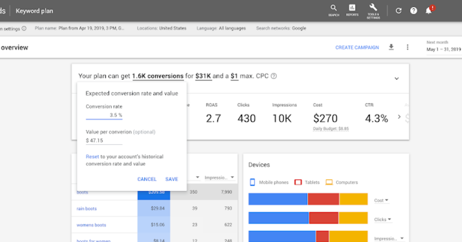


 Jimmy's Internet Marketing Business Blog